Concept design of massage gun for Bang & Olufsen
Independent industrial design concept for a Bang & Olufsen-inspired massage gun, from brand research and sketches to prototypes and final visuals.
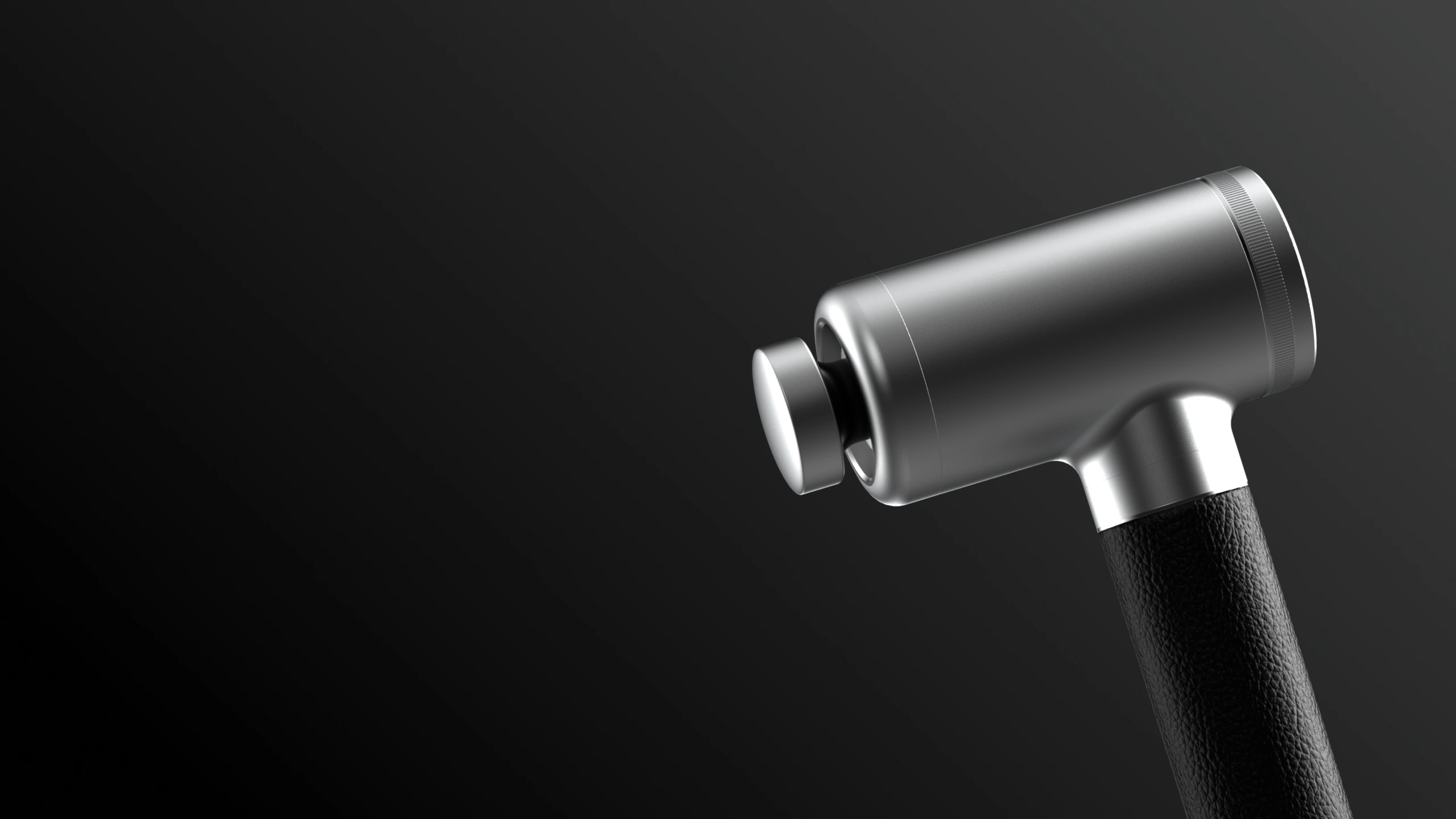
Overview
Designing in the language of an existing brand
I designed a concept massage gun using the design language of Bang & Olufsen. I went through the entire process from researching the brand's identity to sketches, 3D printed prototypes and final rendered visuals.
Context
Understanding what makes their products iconic
I had to design something that would visually fit inside an existing brand's product line even though they would never actually make it.
I chose Bang & Olufsen and a massage gun because the two have absolutely nothing in common, which is exactly what made it a good challenge.
Research
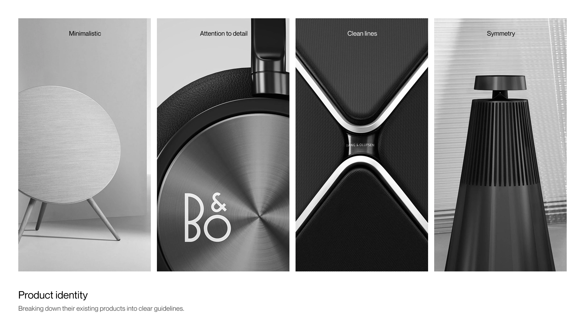
Breaking down what makes their products look like theirs
Before designing anything I needed to understand what the brand's design language is. I pulled apart their lineup looking for patterns in how they handle material transitions, how they balance mass, and how they use negative space.
Ideation
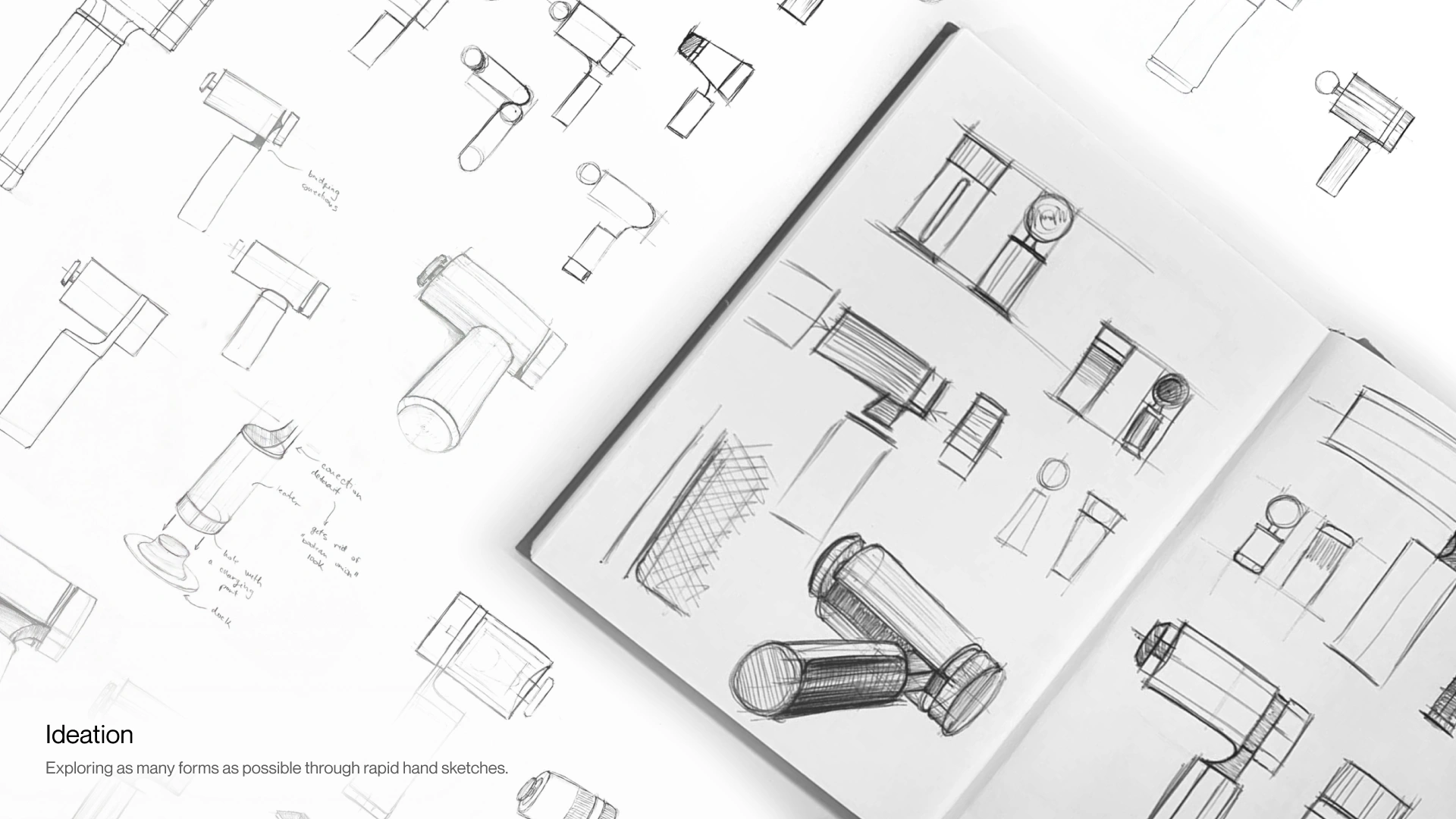
Exploring shapes before opening any software
I started with rapid paper sketches to test as many forms as possible. At this stage it's about volume and not polish so I could quickly figure out which shapes actually felt like they could belong to the brand.
CAD
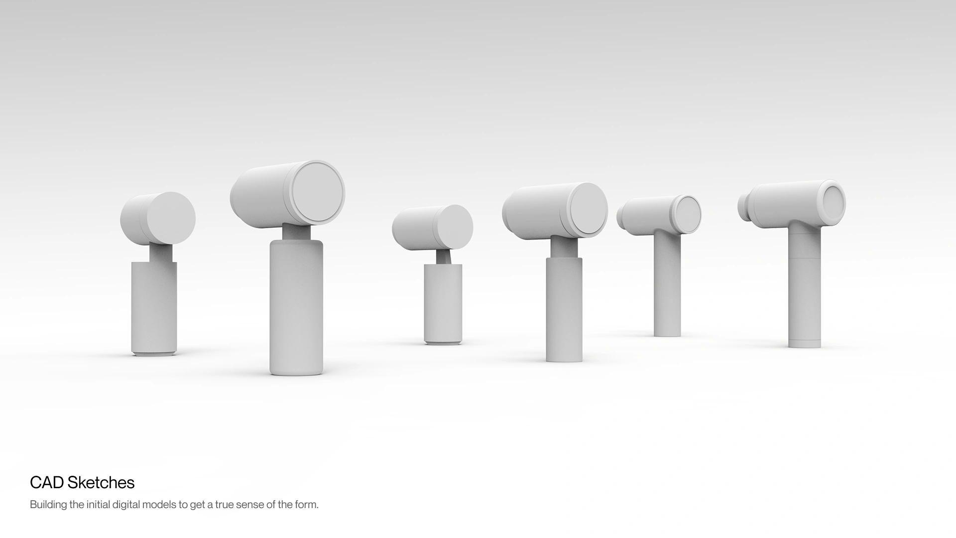
Moving the best ideas into a digital environment
I took the strongest sketches and translated them into 3D CAD models. Moving into a digital environment enhanced my awareness of proportion and let me iterate quickly on the fine details.
Mockups
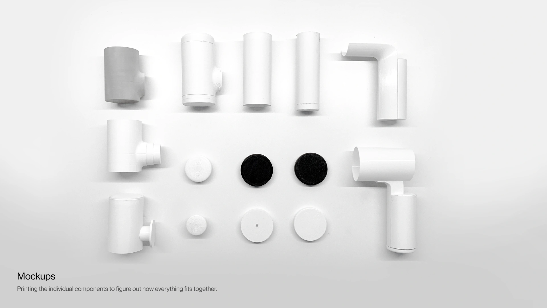
Testing form and ergonomics with early mockups
I 3D printed multiple rough variations to figure out how the form actually sits in a hand. Things like weight distribution were invisible on screen so I only understood them by holding the mockups.
Prototyping
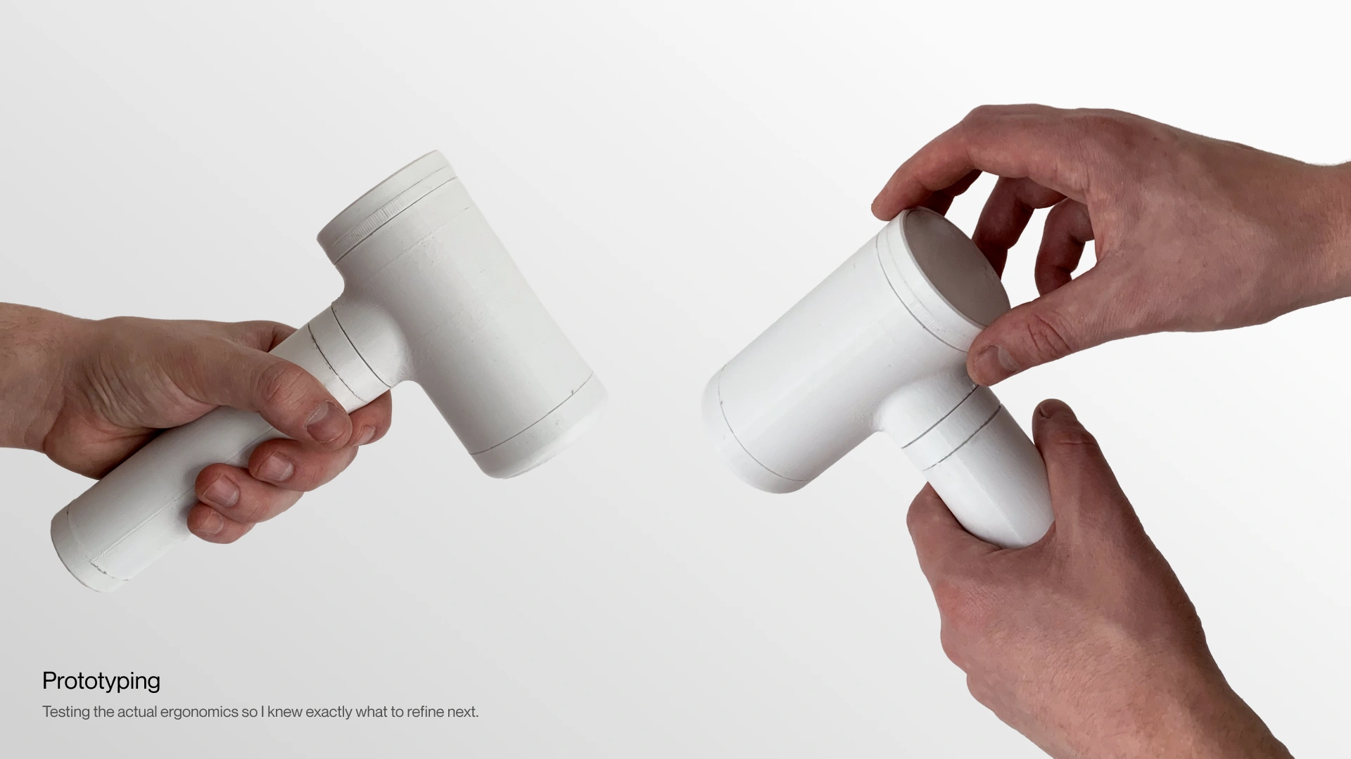
Building a physical model to test the exact details
Moving past rough mockups I printed detailed PLA prototypes to test the exact surface textures and mechanical clearances. Holding the plastic parts helped me figure out how the device would actually function and where the design still needed work.
More mockups
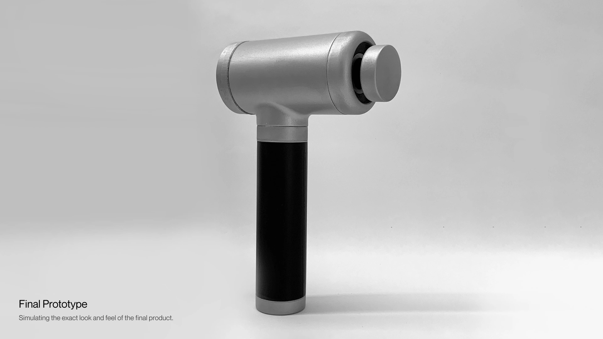
A complete physical representation of the concept
The last step before the digital renders was building a mockup that simulated the exact look and feel of the final design.
Final design
And this is how it finally turned out
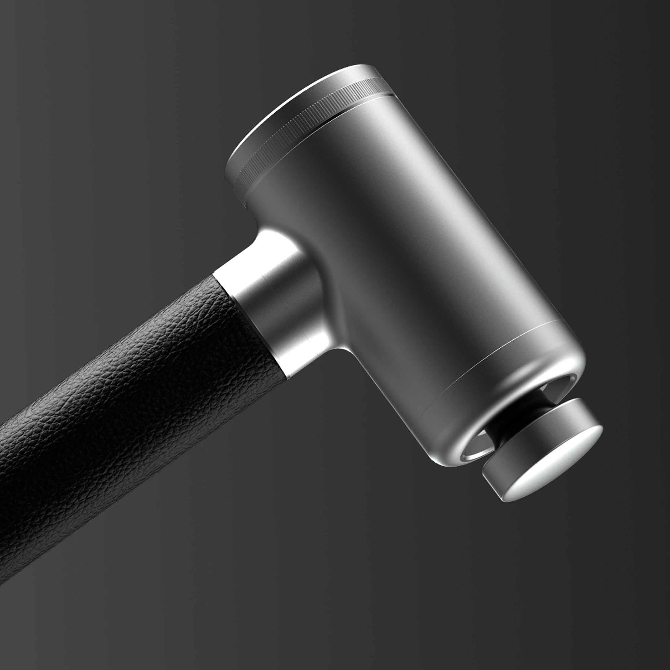
I went back and forth on the small details until the design actually felt right. It took a lot of refining to make sure it resonated perfectly with their visual identity.
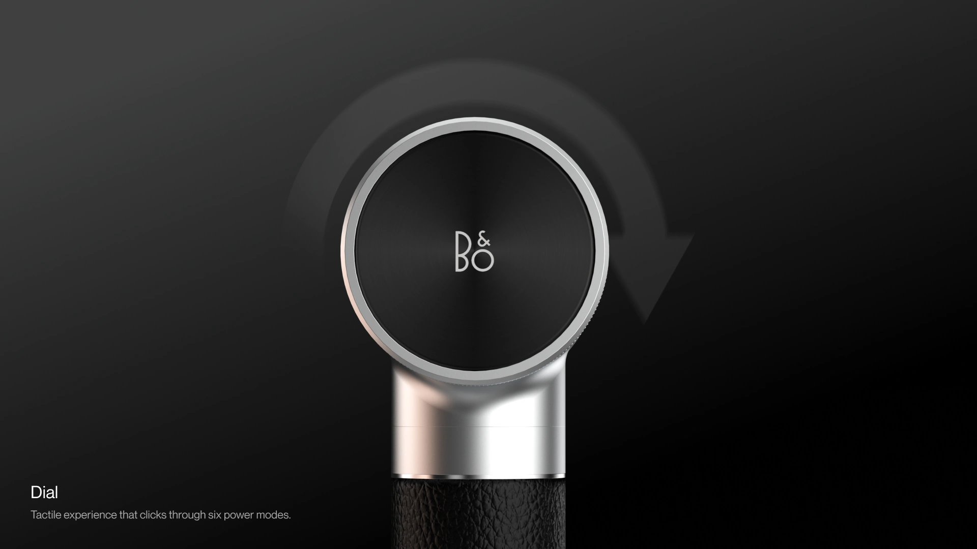
Dial
Building the entire interaction around one rotating dial
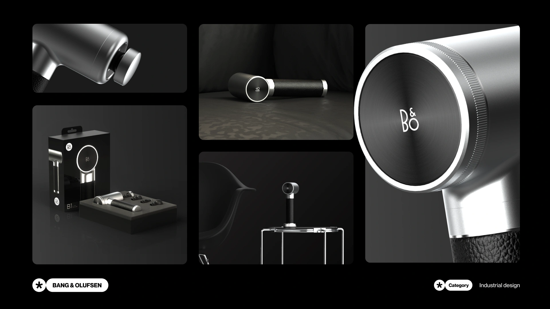
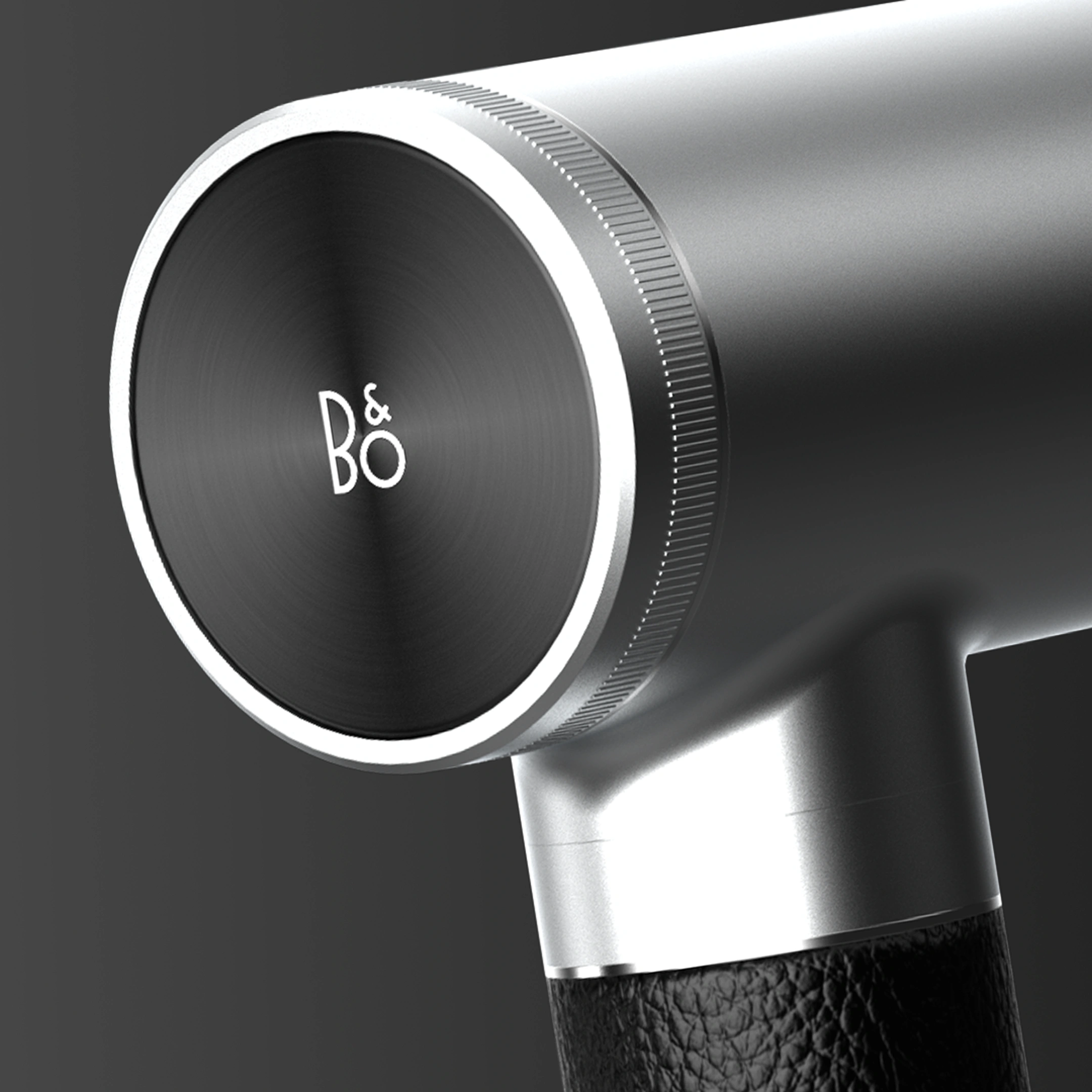
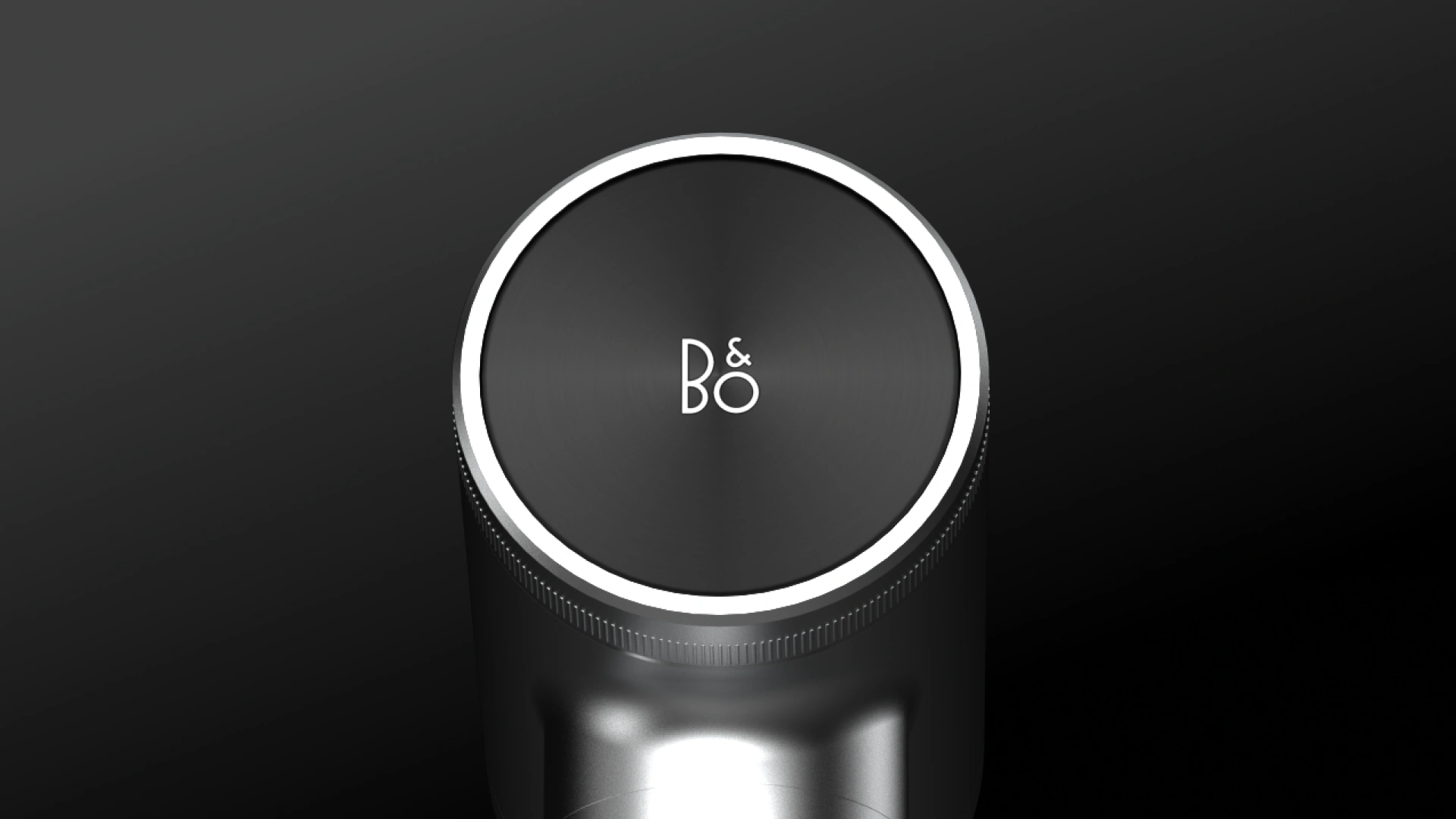
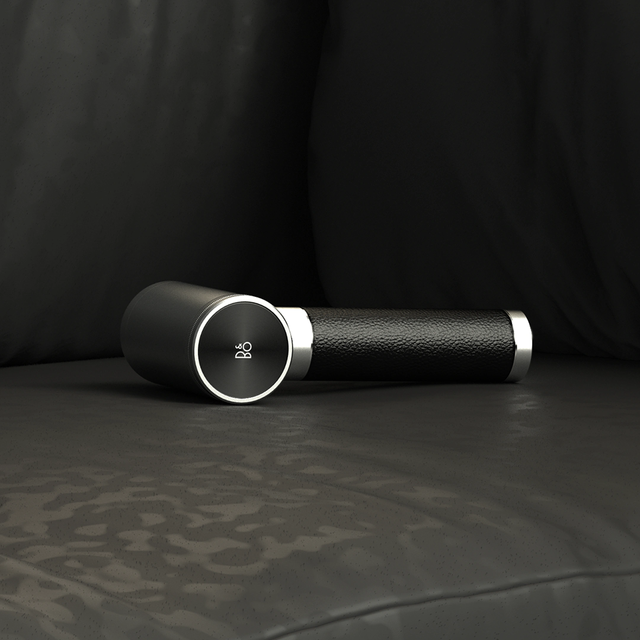
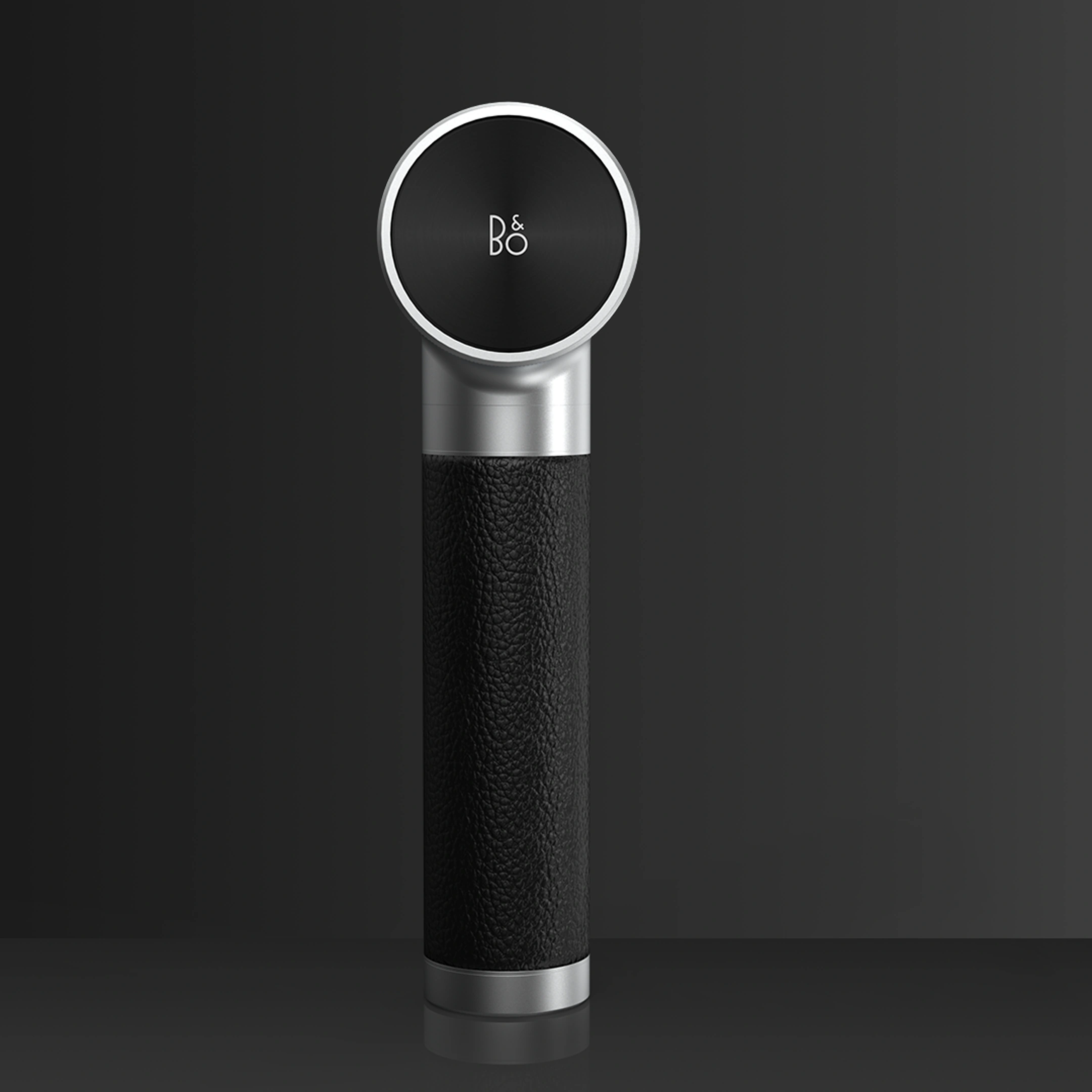
The final design uses a polished aluminum rotating dial and a leather-wrapped handle. Instead of plastic buttons or a touchscreen I designed a single dial that clicks through six power modes so you feel every step.
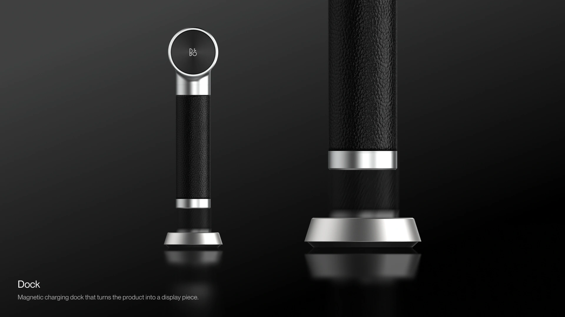
Dock
Making sure it doesn't end up in a drawer
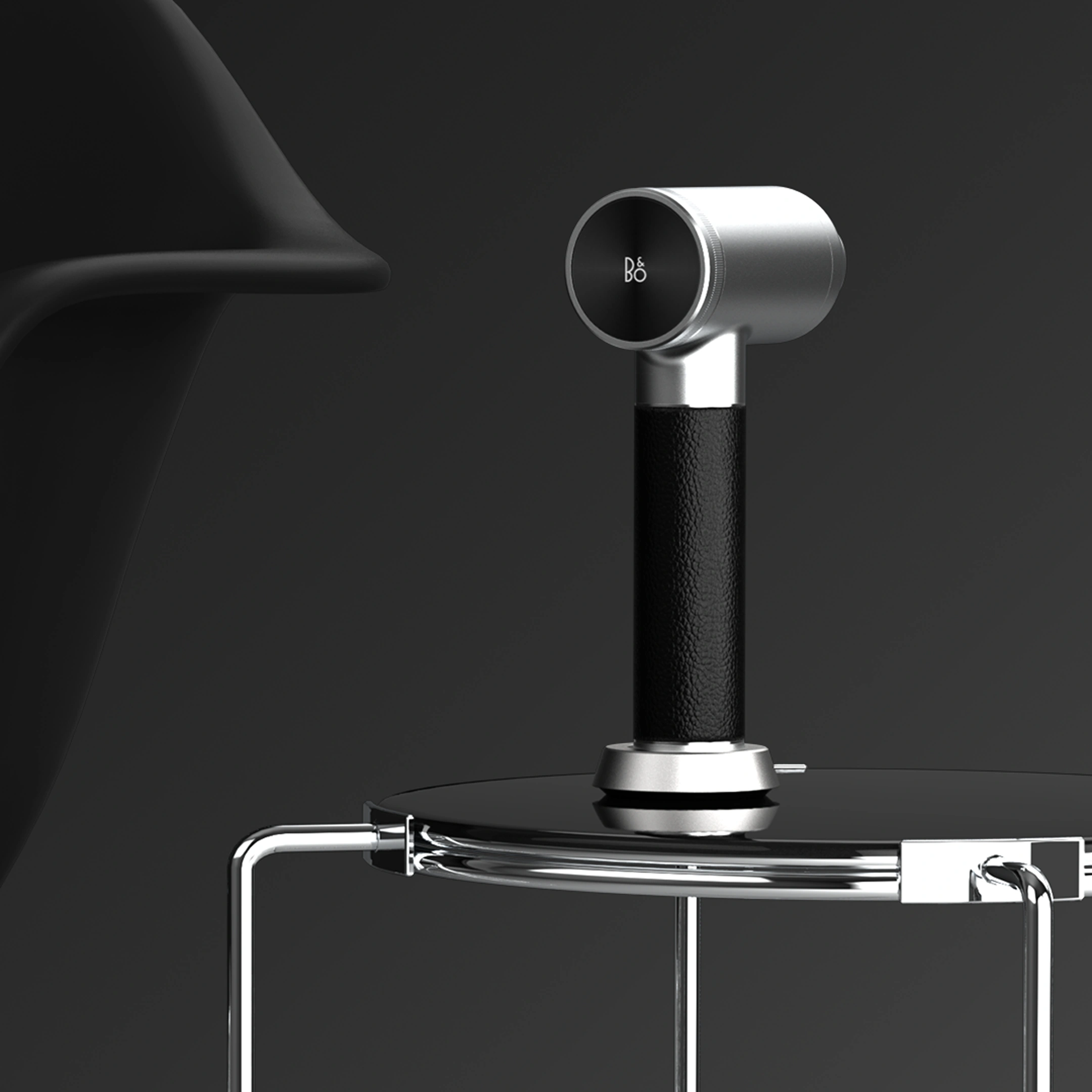
Most massage guns disappear after use. I designed a magnetic charging dock that lets it stand upright as an object in a room.
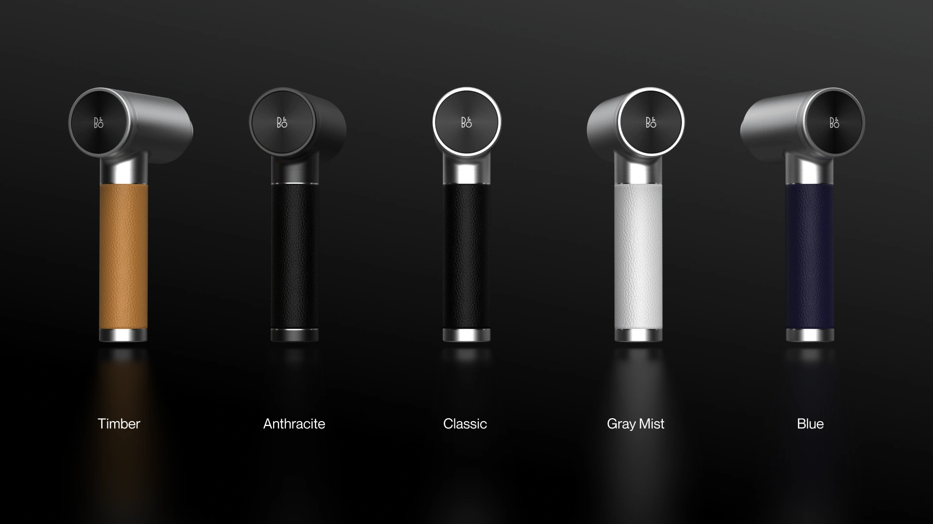
Personalisation
Fitting into completely different interior styles
I developed several material and color variations to show how the same form can fit completely different interior styles.
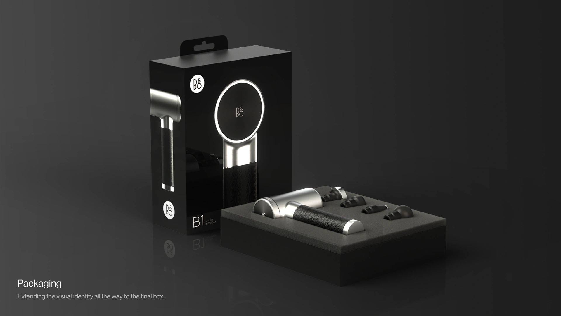
Packaging
Designing packaging that matches the product inside
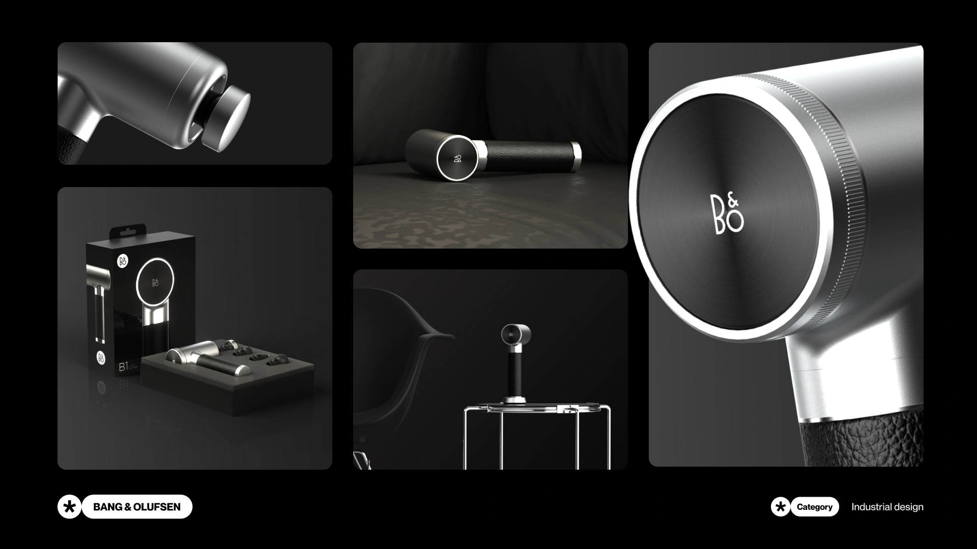
Moving past the product I also designed the complete packaging so the unboxing experience would feel consistent with everything else.
Application
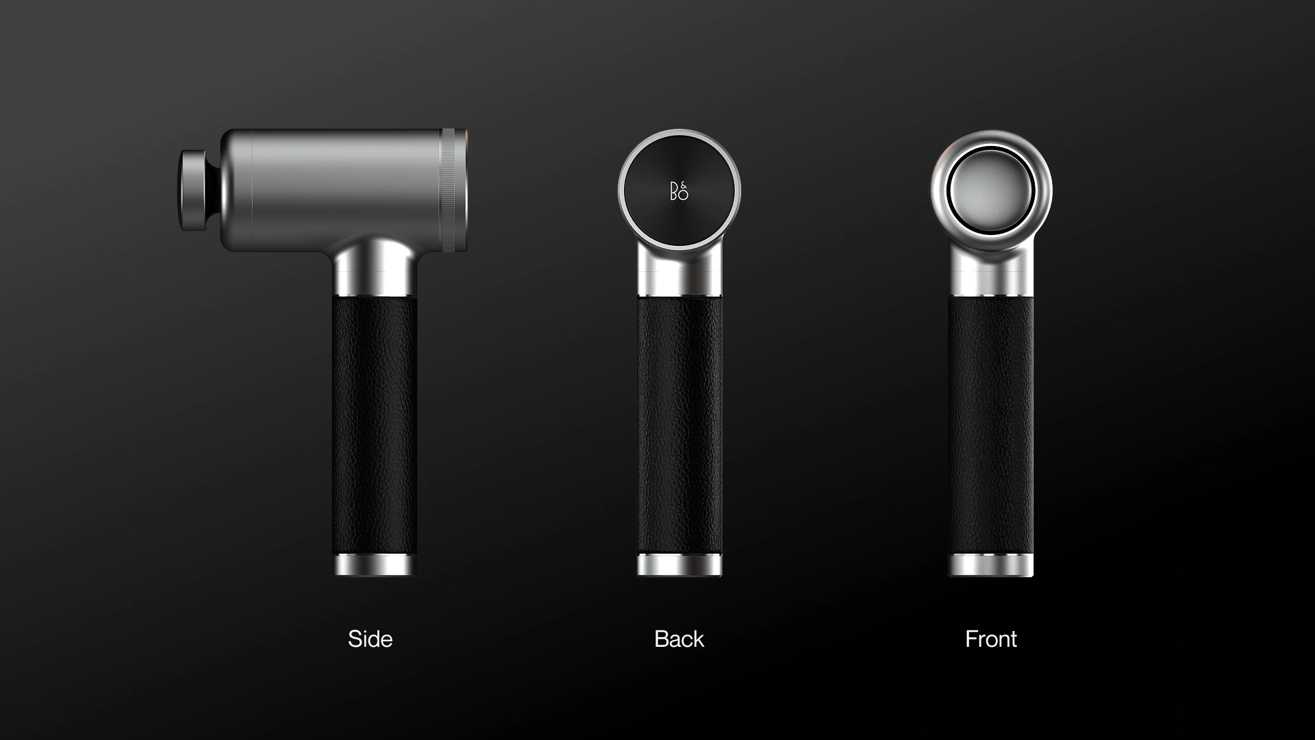
The final look of the concept
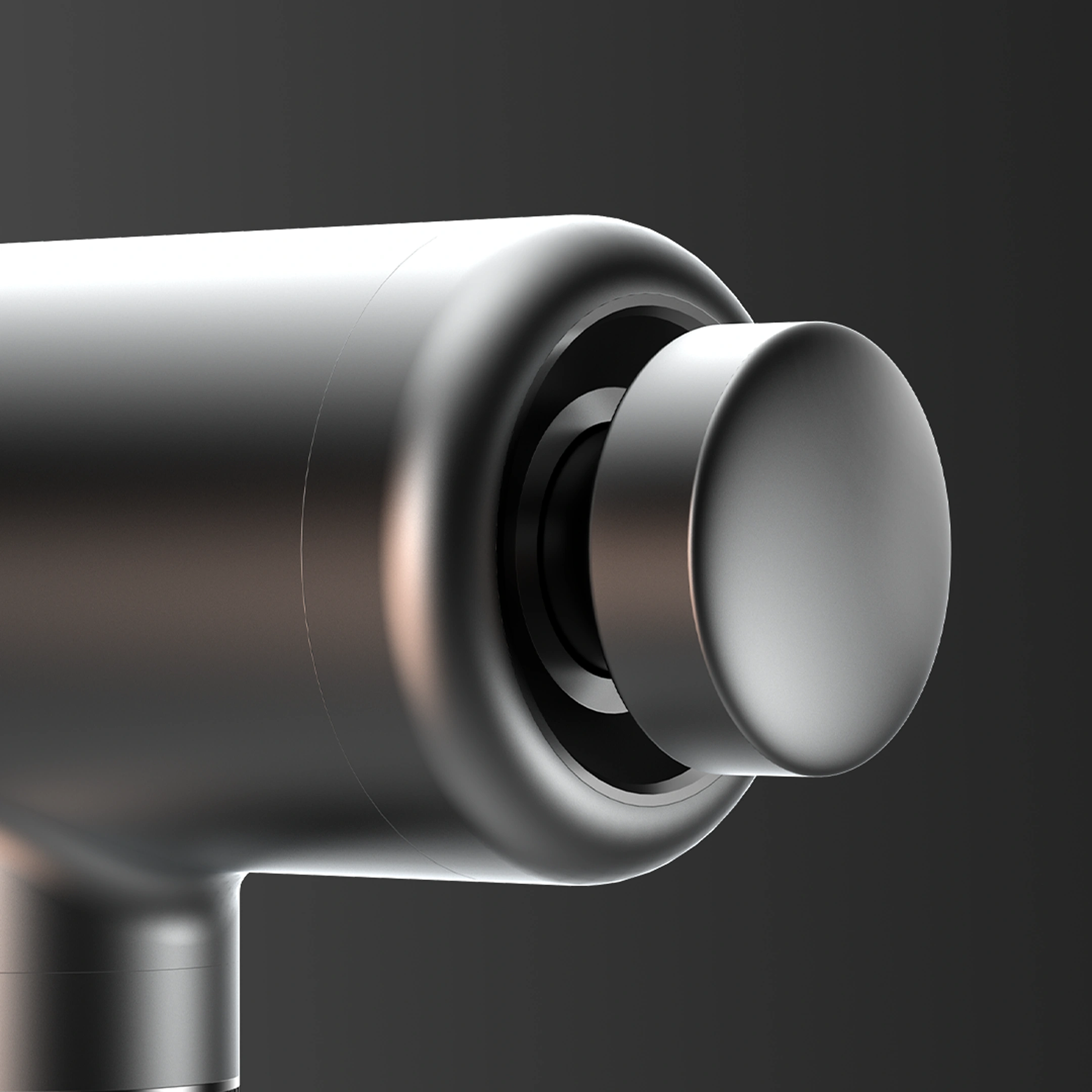
I rendered the final design from multiple angles to show exactly how the materials and forms come together.
Learnings
Learning how to work within an existing design system
This project taught me how to extract visual identity and guidelines from an existing brand and apply them to a completely new form. You have to understand the logic behind their design system and apply those same rules to new problems.