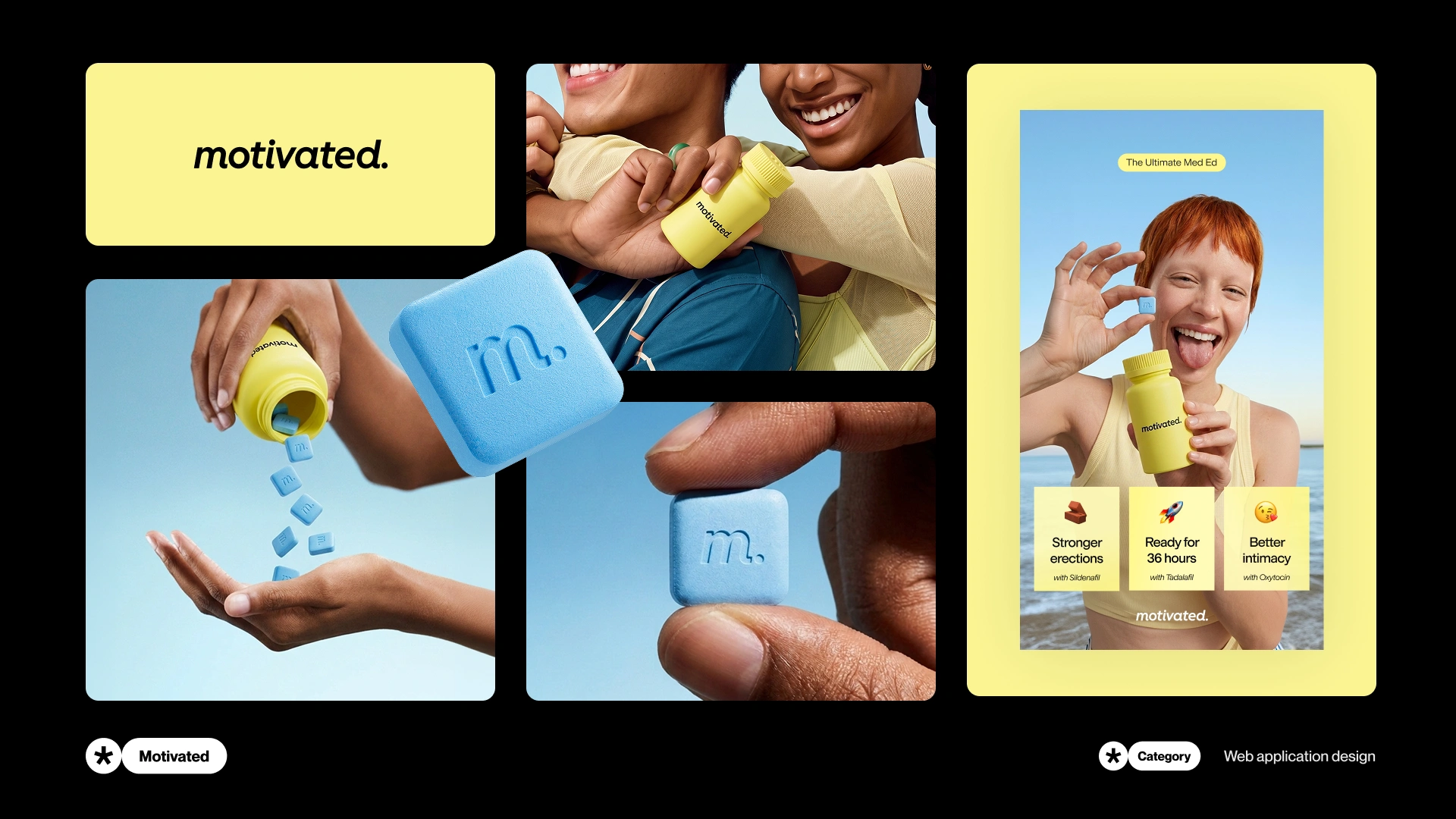
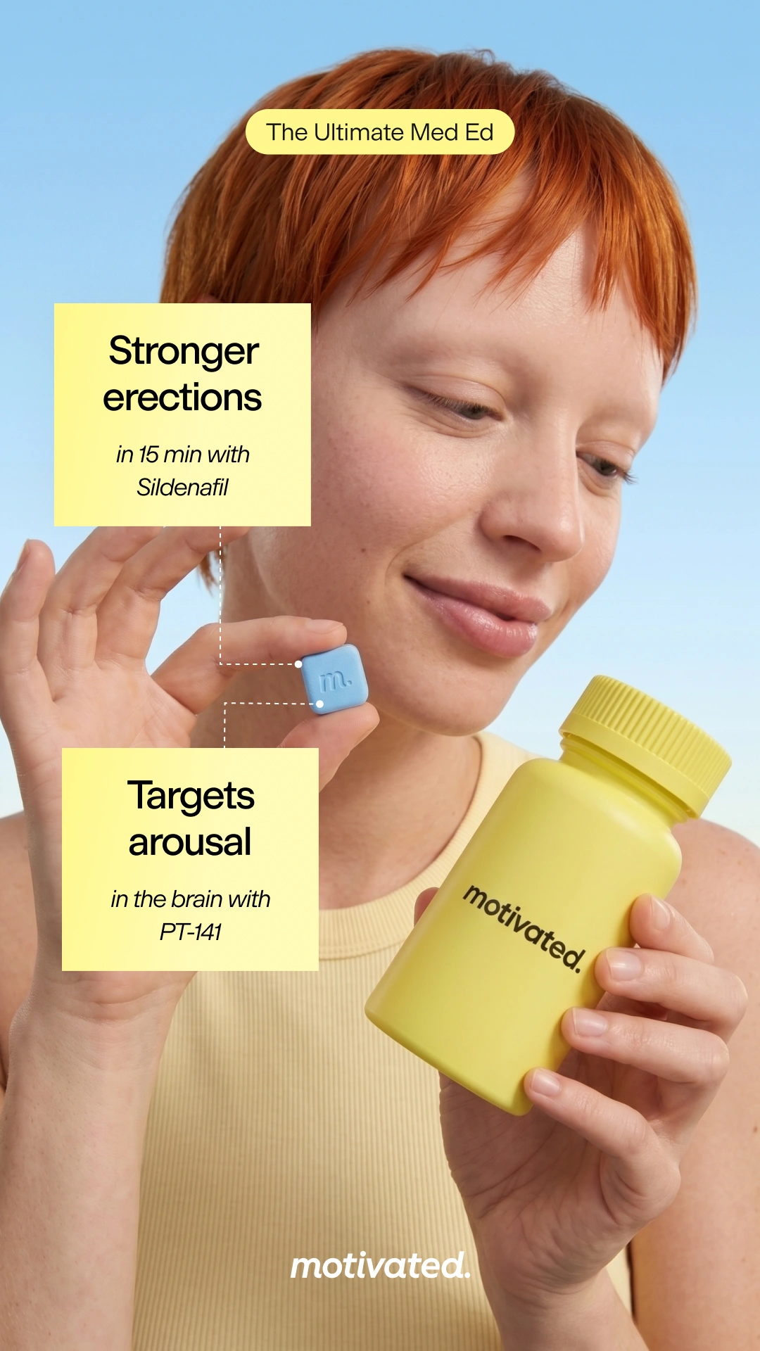
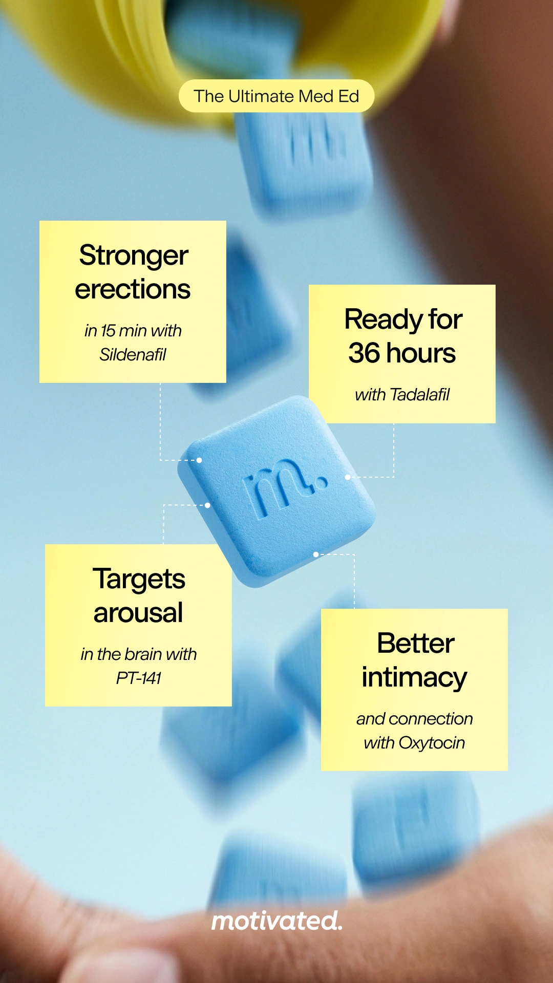
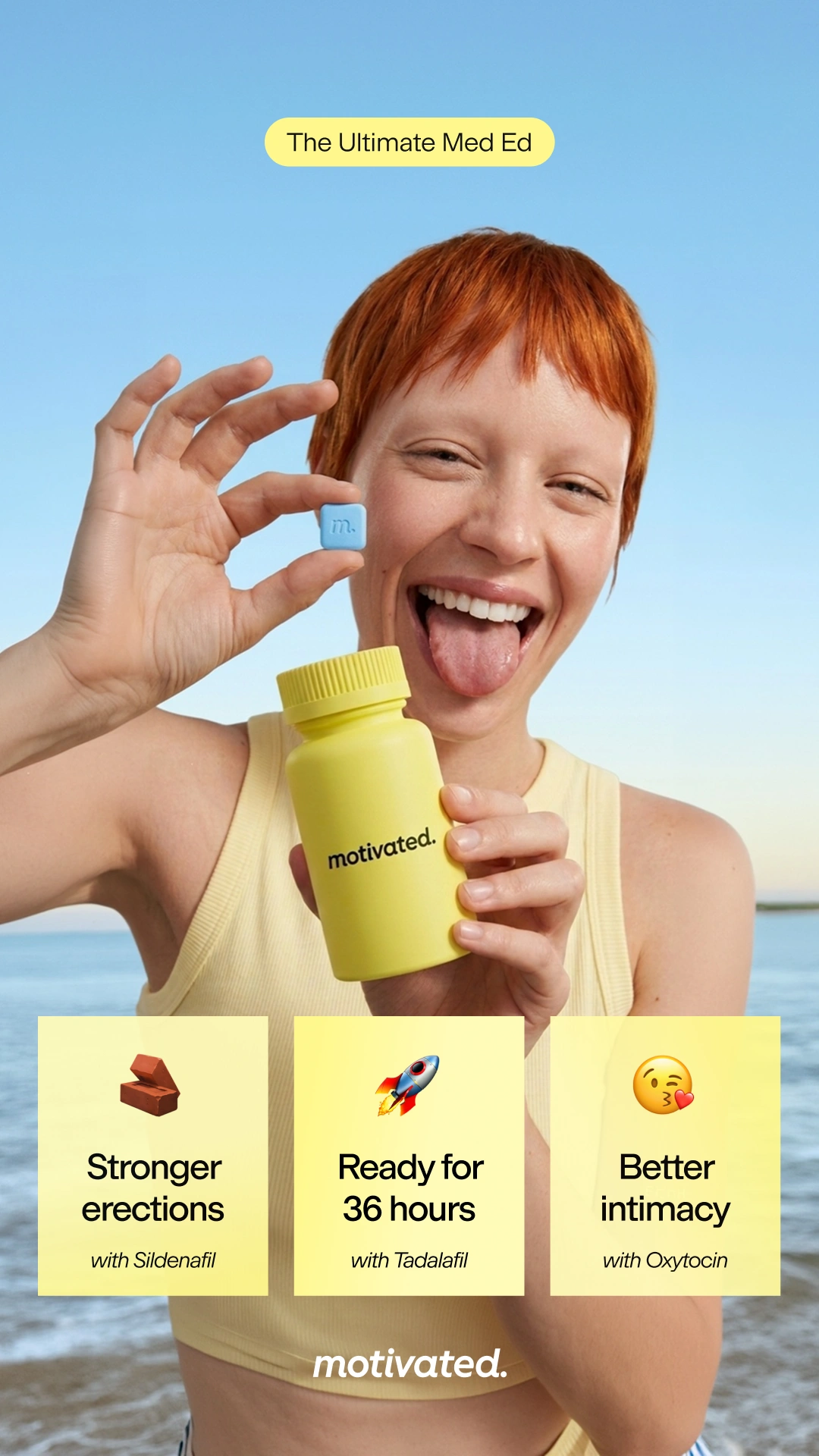
Meta advertising campaign materials for Motivated
As part of an assignment, I designed static and video Meta ads for Motivated, a U.S. telehealth company offering treatments across men's health, hair loss and other health categories. My work focused on Hard+™ Drive, their 4-in-1 ED chew.
Overview
I took a four-banner brief further
As part of an assignment, I designed static and video Meta ads for Motivated, a U.S. telehealth company offering treatments across men's health, hair loss and other health categories. My work focused on Hard+™ Drive, their 4-in-1 ED chew.
Challange
Getting more from the supplied material
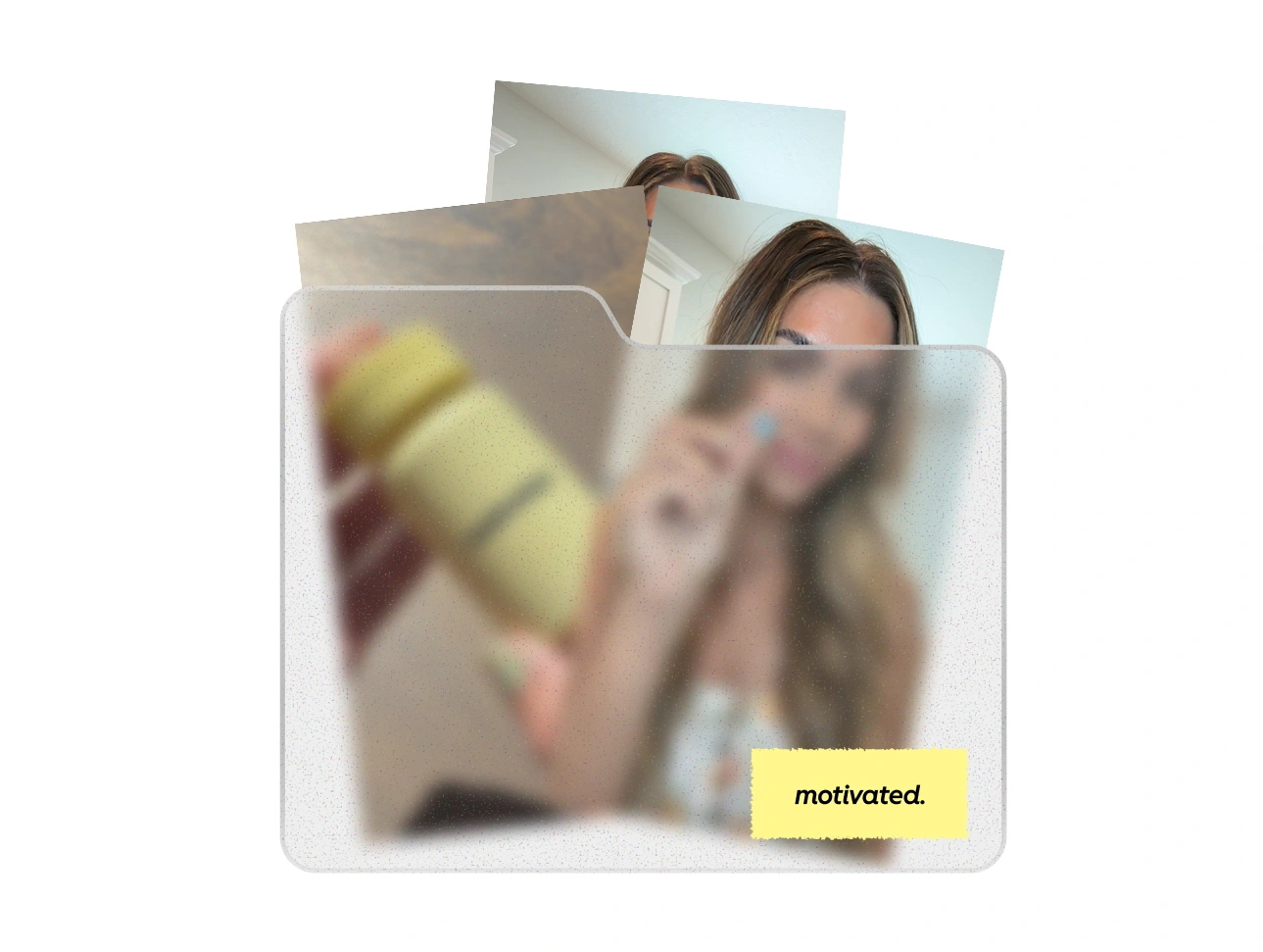
I received a folder of raw assets, including A-roll of a UGC actress, B-roll, product references and supporting materials. I set myself the challenge of turning that limited starting material into a larger collection of images and clips for the ads.
To do that, I needed to understand their branding and decide how far I could take the visuals. I wanted room to experiment while keeping the product recognisable and close to the supplied references.
First step
Before designing, I needed a direction
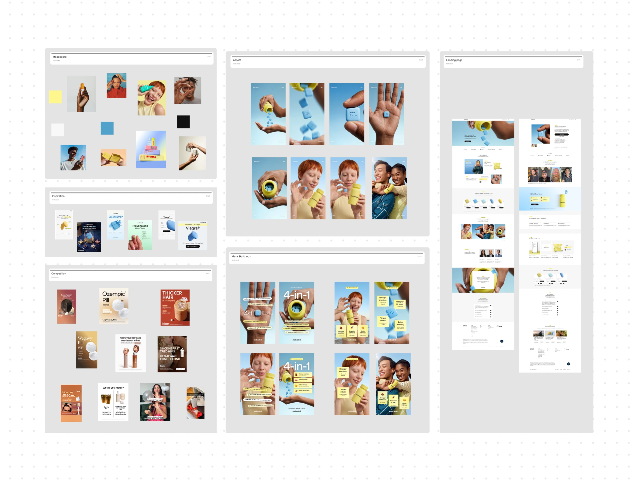
For me, the most important thing when starting a campaign is having a clear direction and design guidelines in place. I went through Motivated's website, pulled together the fonts, colours and visual references, and made myself a moodboard.
I also looked at Hims, Rugiet and Bluechew to compare their layouts, product imagery and ways of presenting benefits. That helped me decide what to explore with Motivated's own assets before making the first ads.
Photo assets
I treated it like a branding project
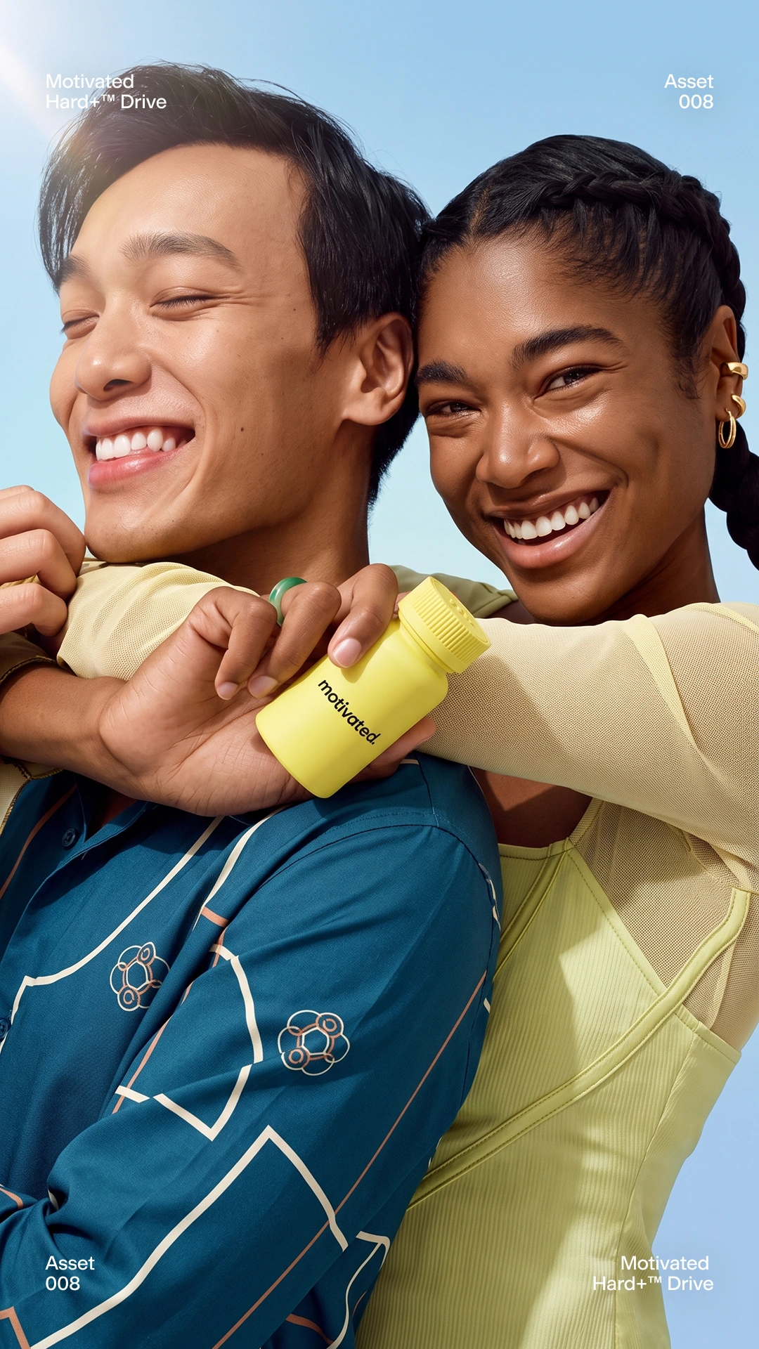
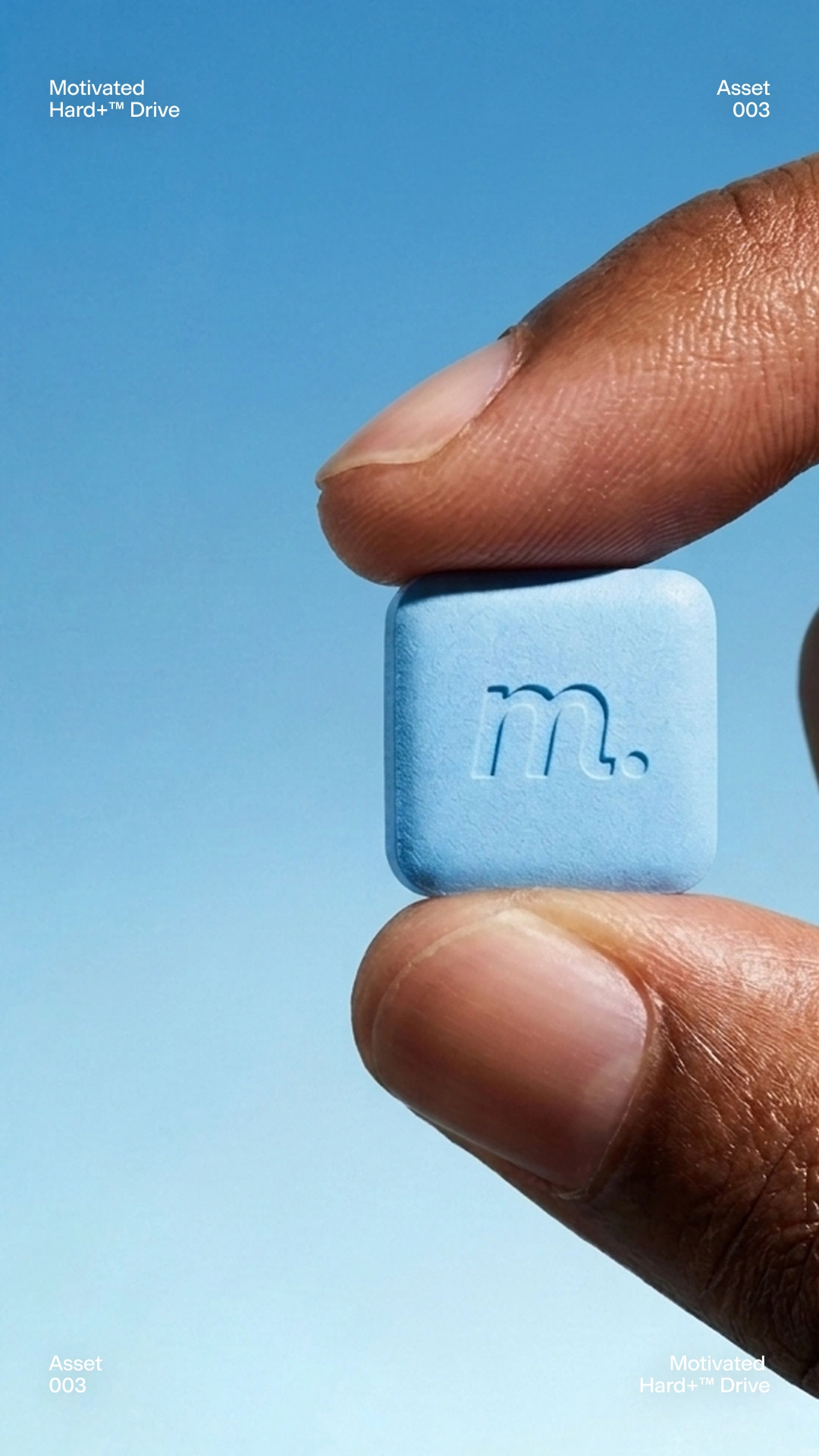
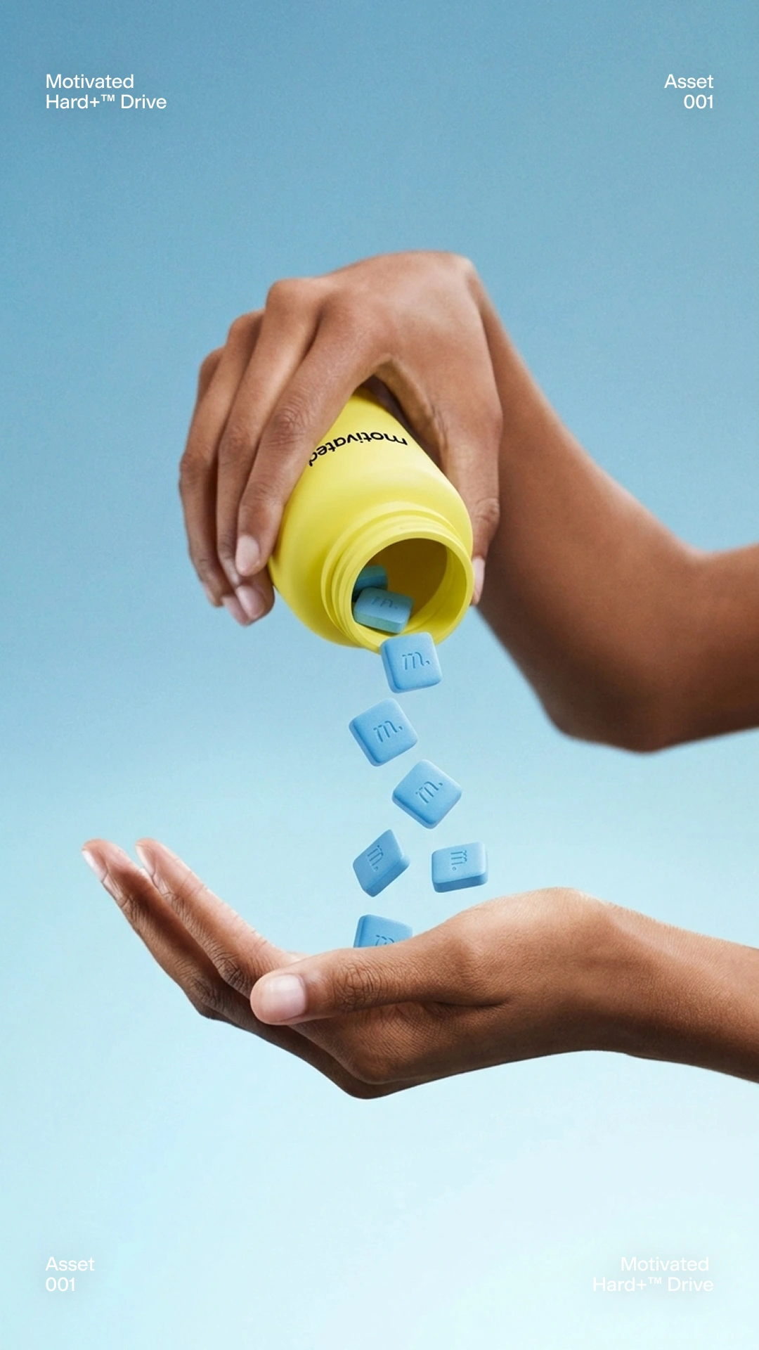
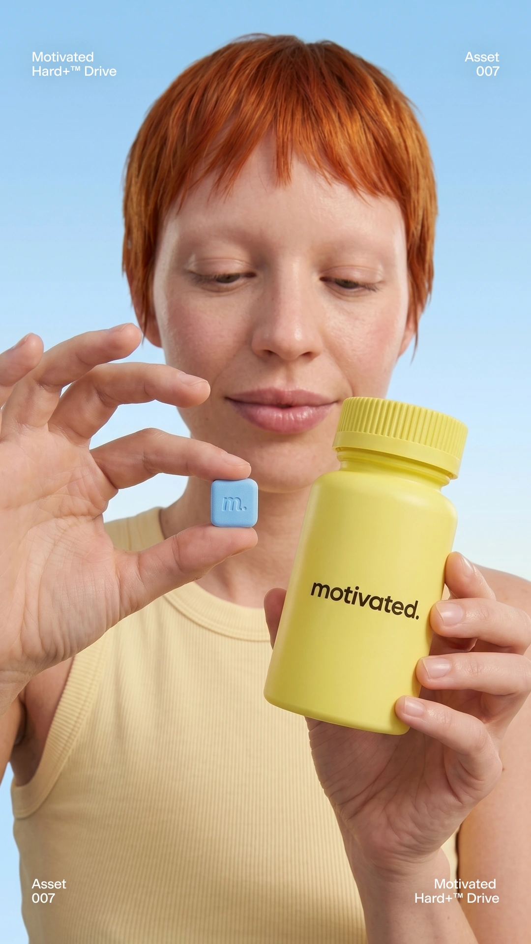
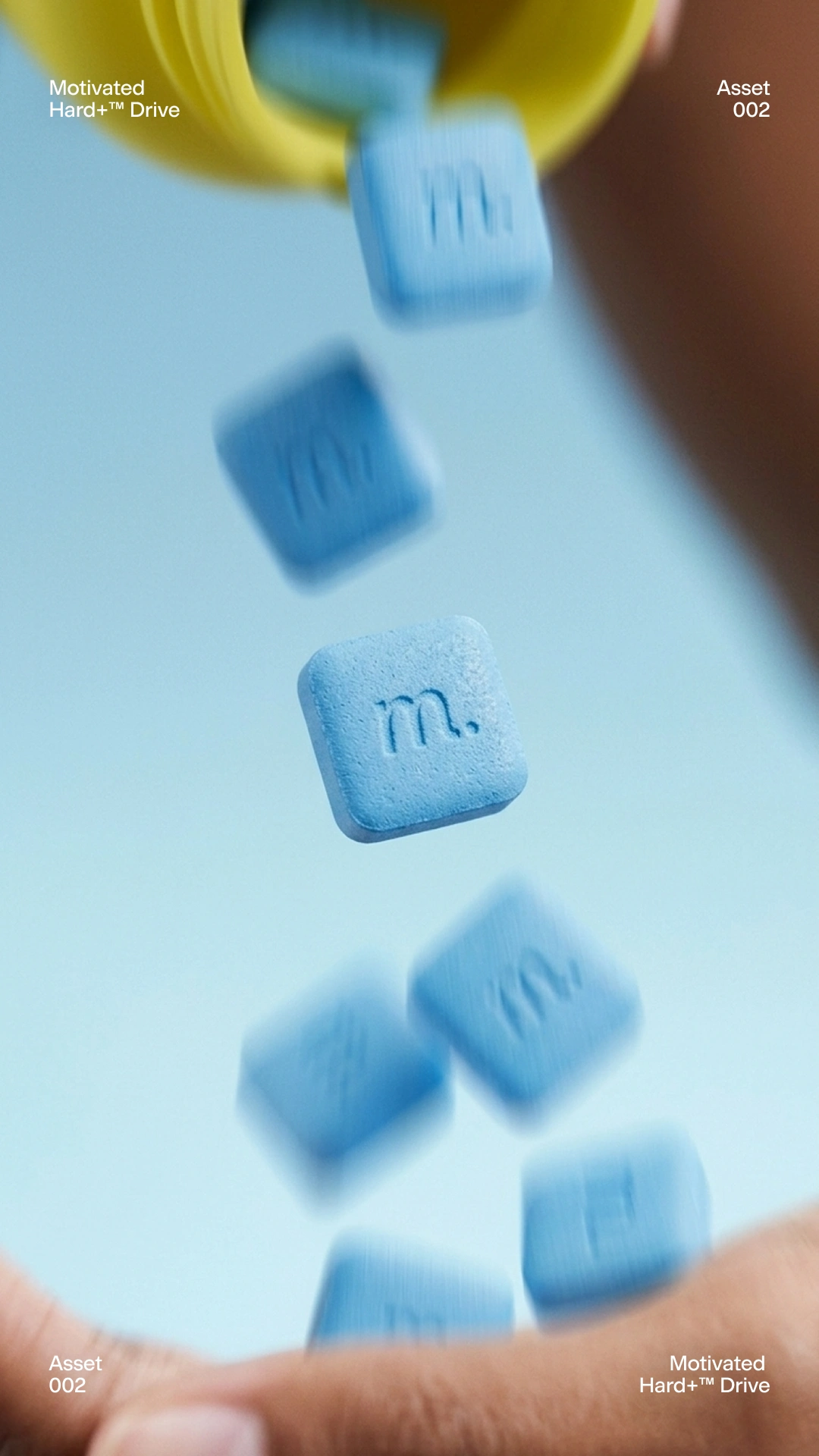
Even though the assignment was about ads, I wanted to spend time on the images first. The blue and yellow already gave me something interesting to work with, so I pushed that into close-ups, pouring shots and portraits with a more playful feel.
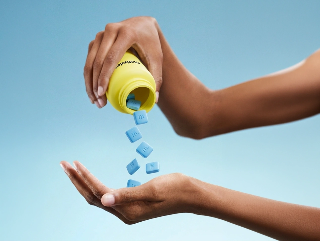
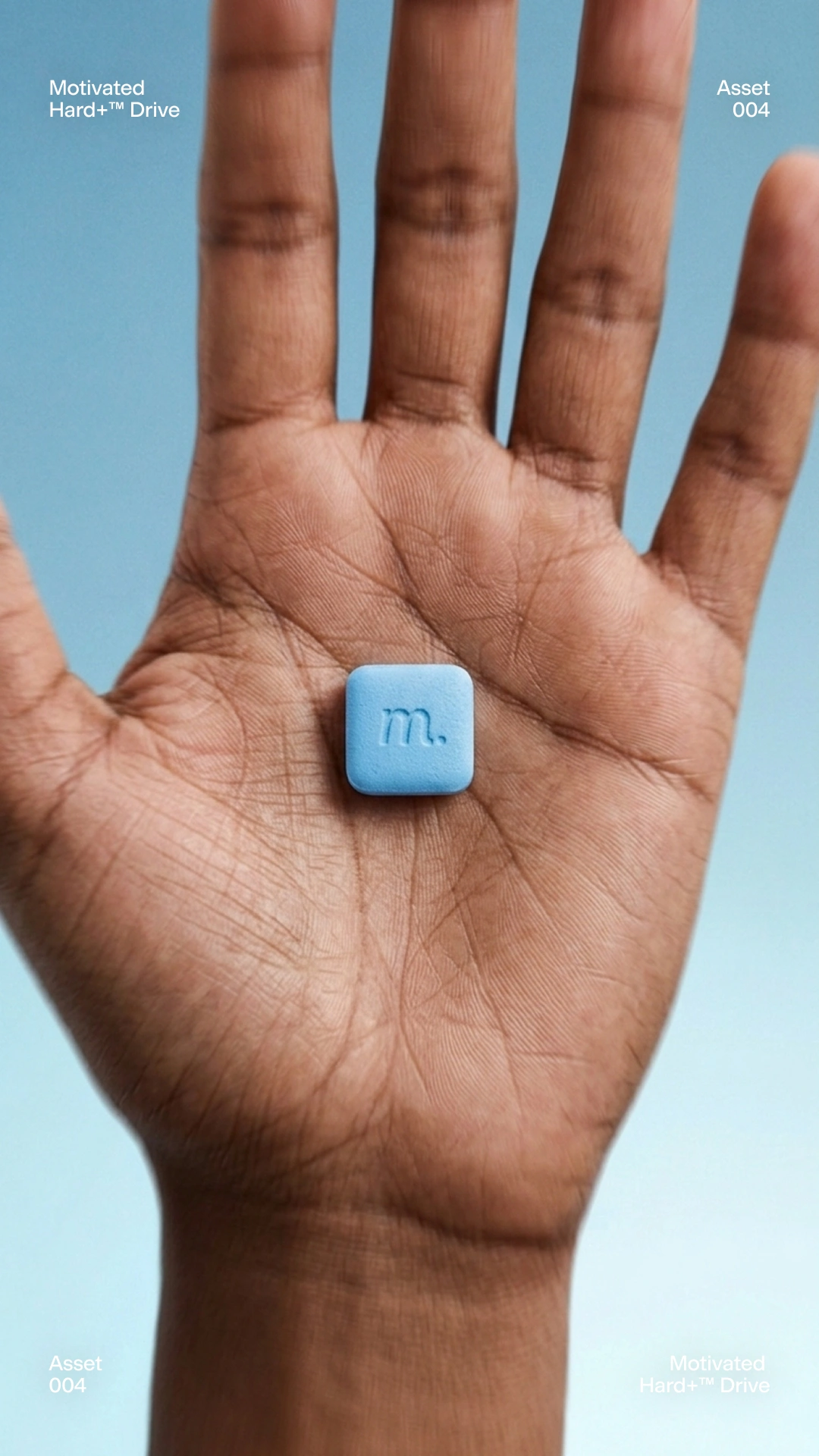
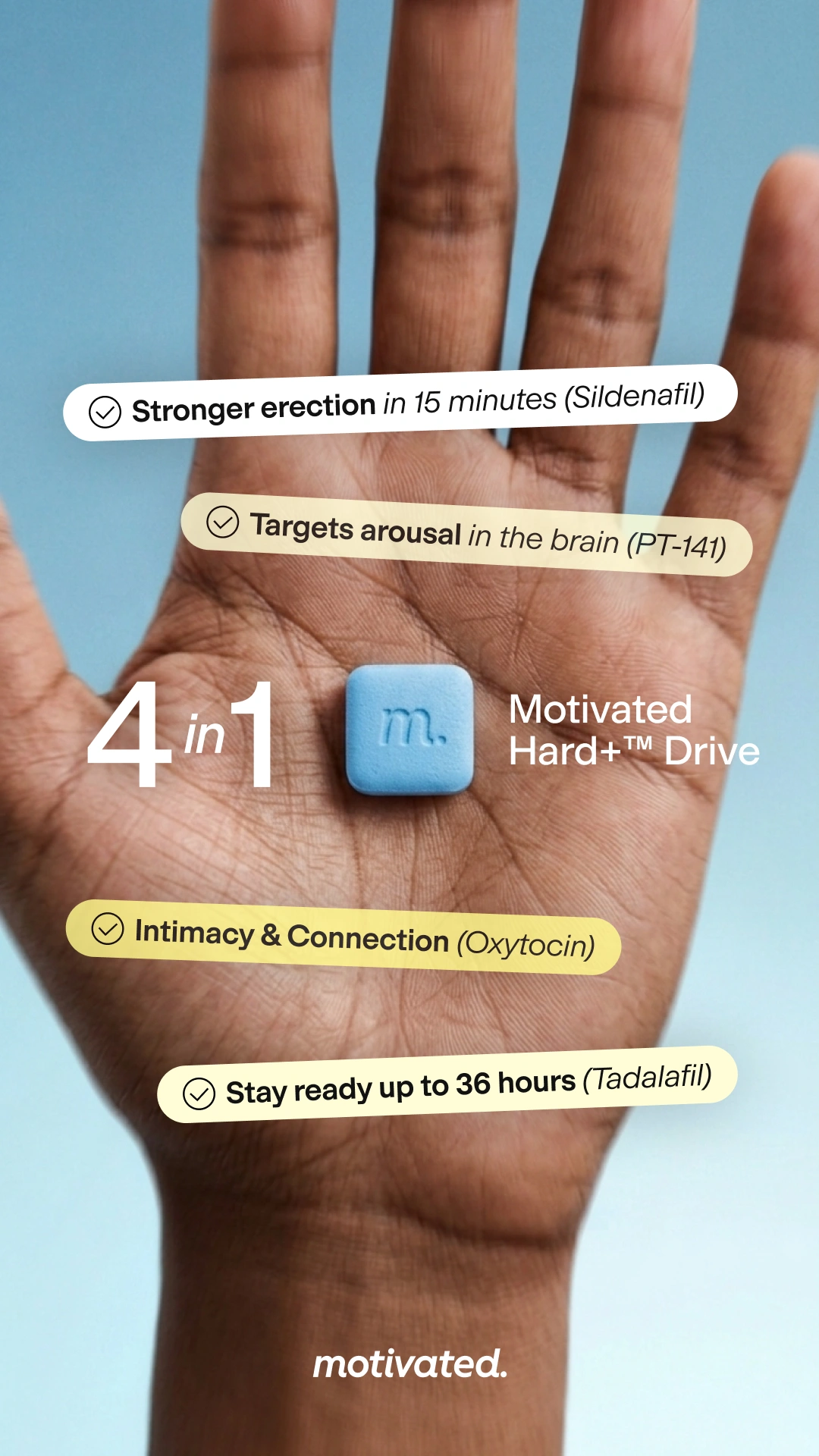
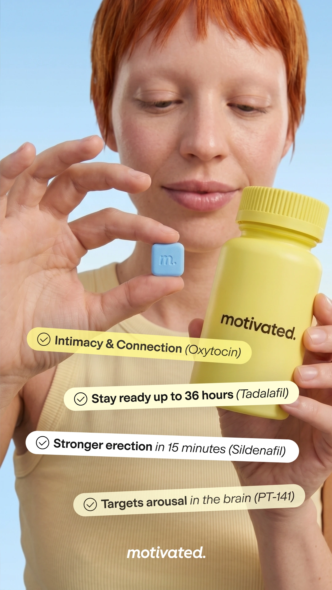
I generated the images with Nano Banana 2 and a careful prompt structure, experimenting with pouring chews, close-ups in a palm and people holding the bottle. Across those scenes, I kept the product's appearance, proportions and texture close to the references so the set stayed consistent.
Video assets
Bringing the images to life
From the generated images, I used Google Flow to create moving product shots. These gave me extra material to work with alongside the supplied footage when editing the Meta ads.
This was another reason to work on the images first. I could use the same assets for the static ads and as a starting point for the video material.
Static Ads
Building the first batch of static ads
With the product images ready, I started designing the static ads in Figma. I used the brief and competitor research as a starting point, then explored different ways to combine the product, headlines and benefits across different layouts.
Static Ads
Building the second batch of static ads
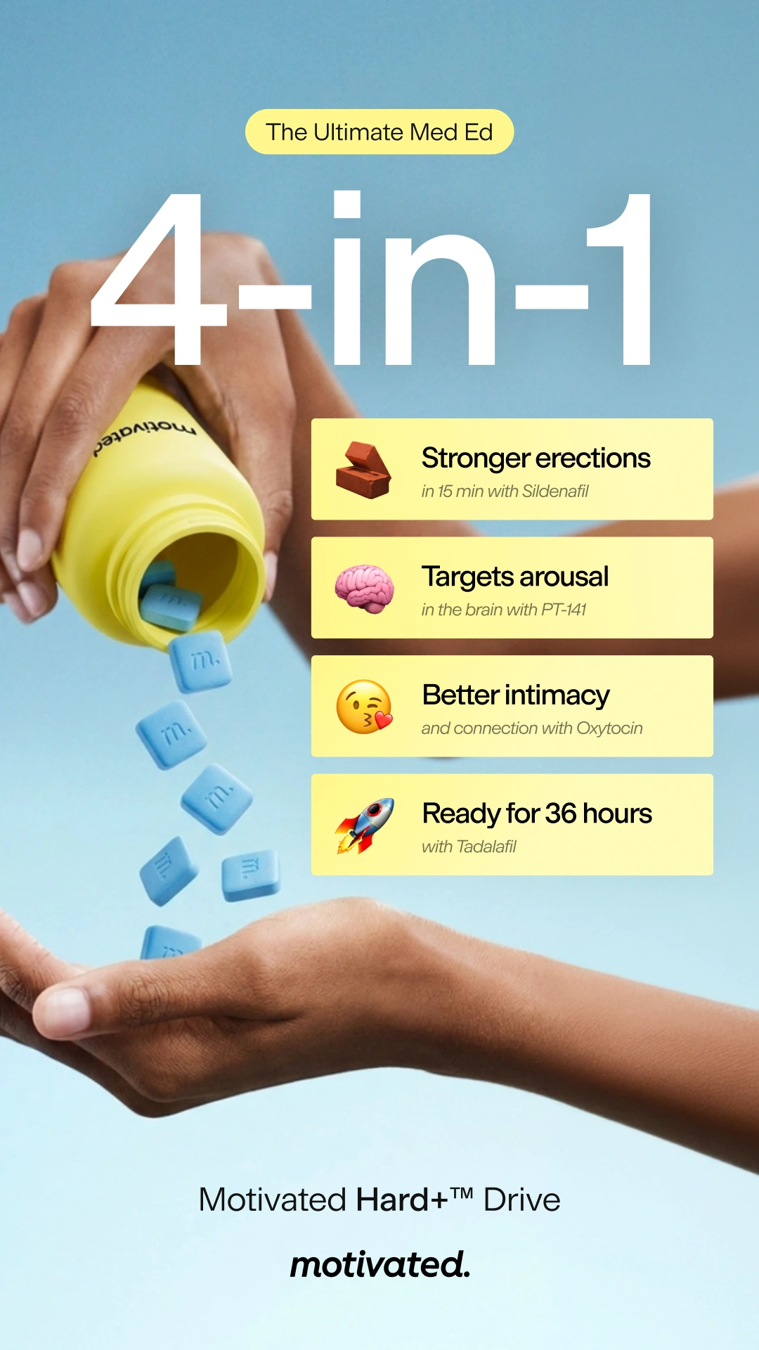
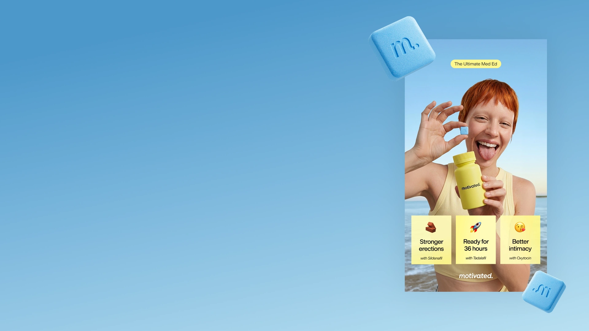
Some versions used a large 4-in-1 headline, while others used rounded labels or yellow benefit cards with small icons. I kept the colours, typography and graphic elements consistent across the batch, changing the hierarchy to give each layout a different focus.
Video Ads
Putting the clips together
I edited two videos using their UGC footage and B-roll, then added graphics to match the static ads. I approached the edit a bit like a puzzle, working with a hook, benefits, product features, social proof and a call to action.
Landing page
Carrying the ads onto the landing page
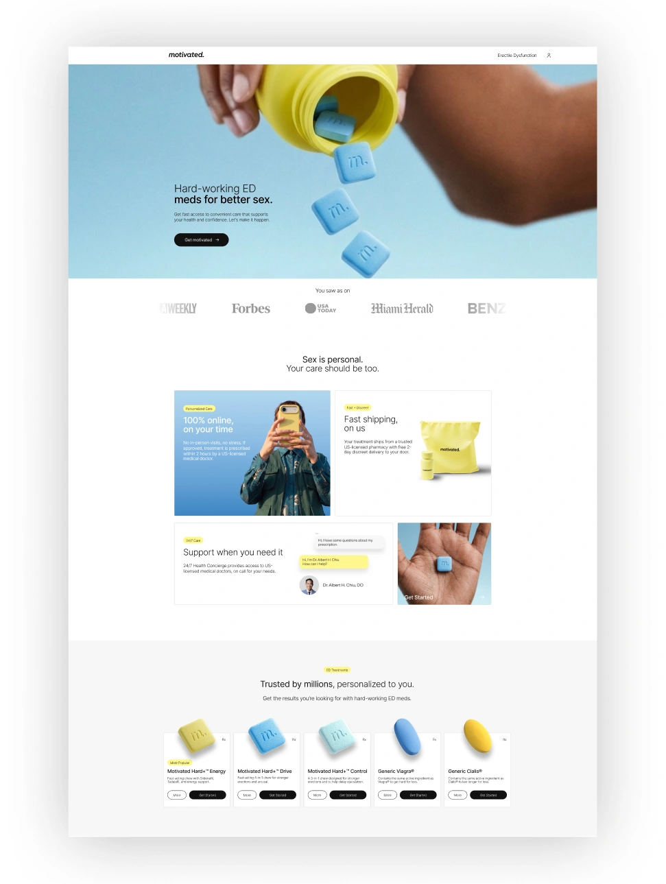
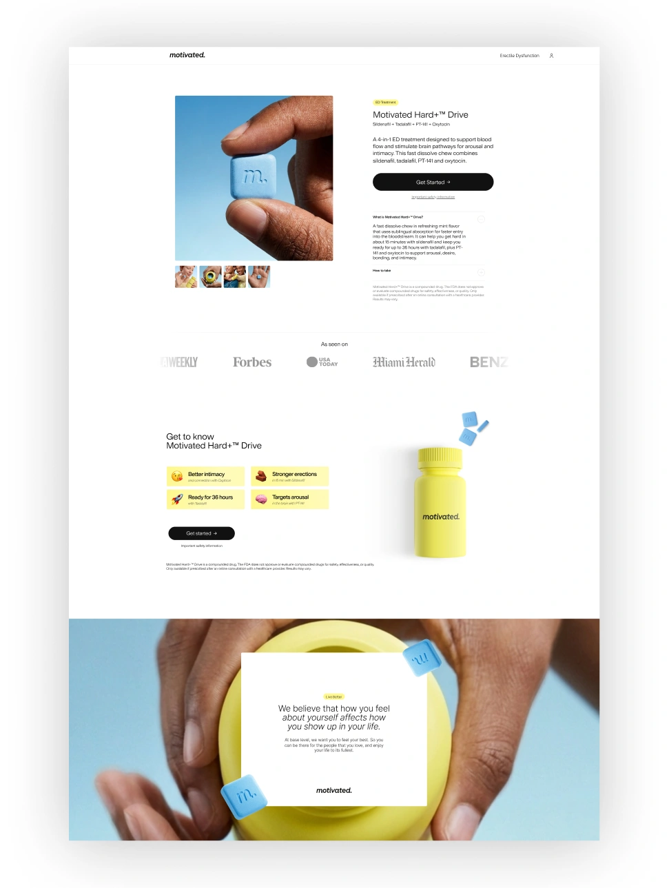
I also looked at their landing page and made a redesign concept as an extra part of the project. If someone clicked one of these ads, I wanted them to recognise the product and the look of the campaign when they arrived.
I switched some of the assets and adjusted the sections to bring the page closer to the ads. The same product imagery and colours helped connect what someone saw in the ad with what they saw on the page.
Learnings
I would start with the images again
The biggest thing I took from this project was how much a good image changes the layout. The open bottle gave me room for a large headline, while the falling chews worked well with separate benefit callouts.
Spending time on those assets gave me more options later, including material for the videos and landing page. For a similar project, I would follow the same order and work out the imagery before settling on the layouts.