UI/UX redesign of Slovenia's most used banking app NLB Klik
UI/UX redesign case study for NLB Klik, focused on research-led user journeys, clearer navigation, and a scalable design system.
Overview
Redesigning the full mobile user experience
I completely redesigned the NLB Klik mobile banking application. By conducting deep quantitative and qualitative research I identified the critical usability issues frustrating users on a daily basis, allowing me to redesign fragmented user journeys, fix broken navigation, and introduce a scalable UI design system. Do you want to read my full Bachelor thesis (in Slovenian): [Click here](https://drive.google.com/file/d/1Ka-MkanNUOes1o-cZKqCMZ5map6vd8V5/view?usp=drive_link)
Research
Discovering the core usability issues through user data
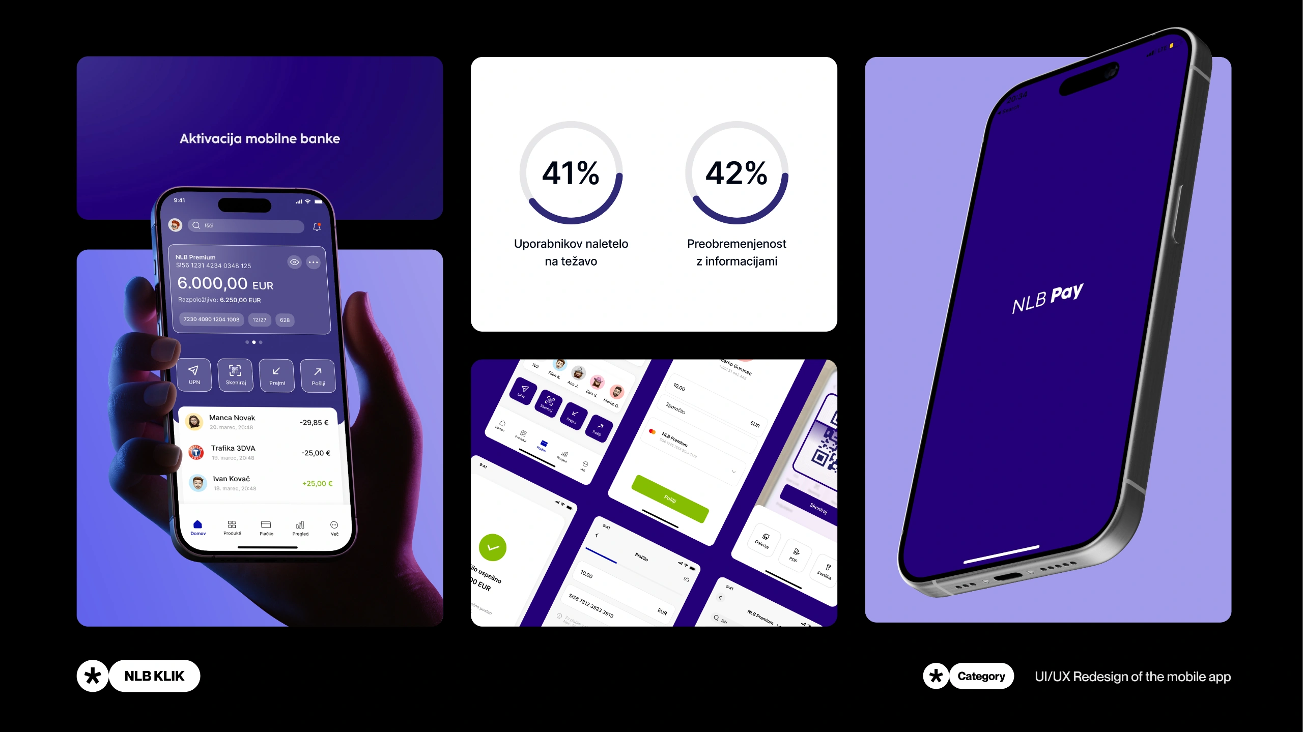
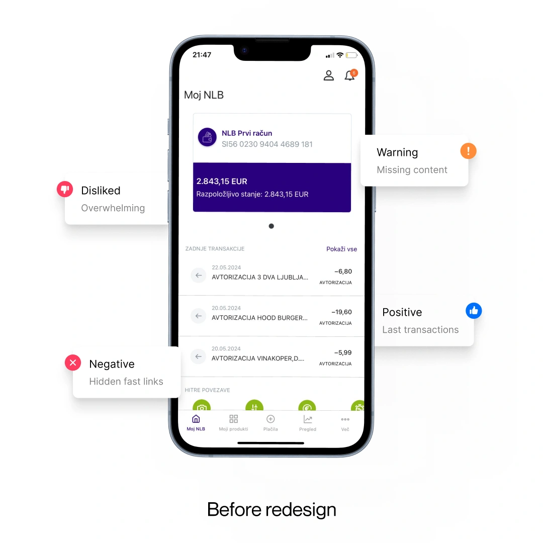
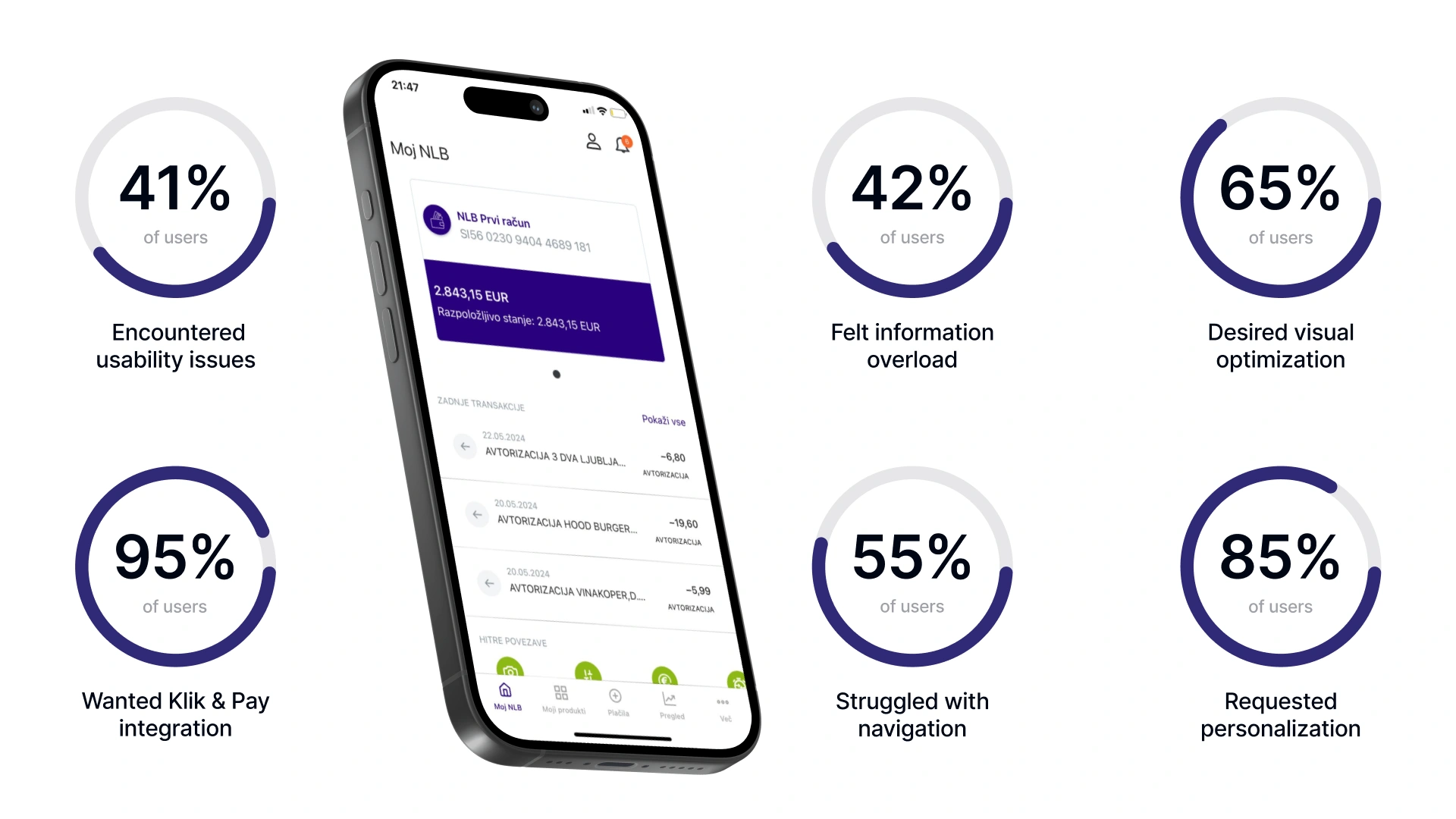
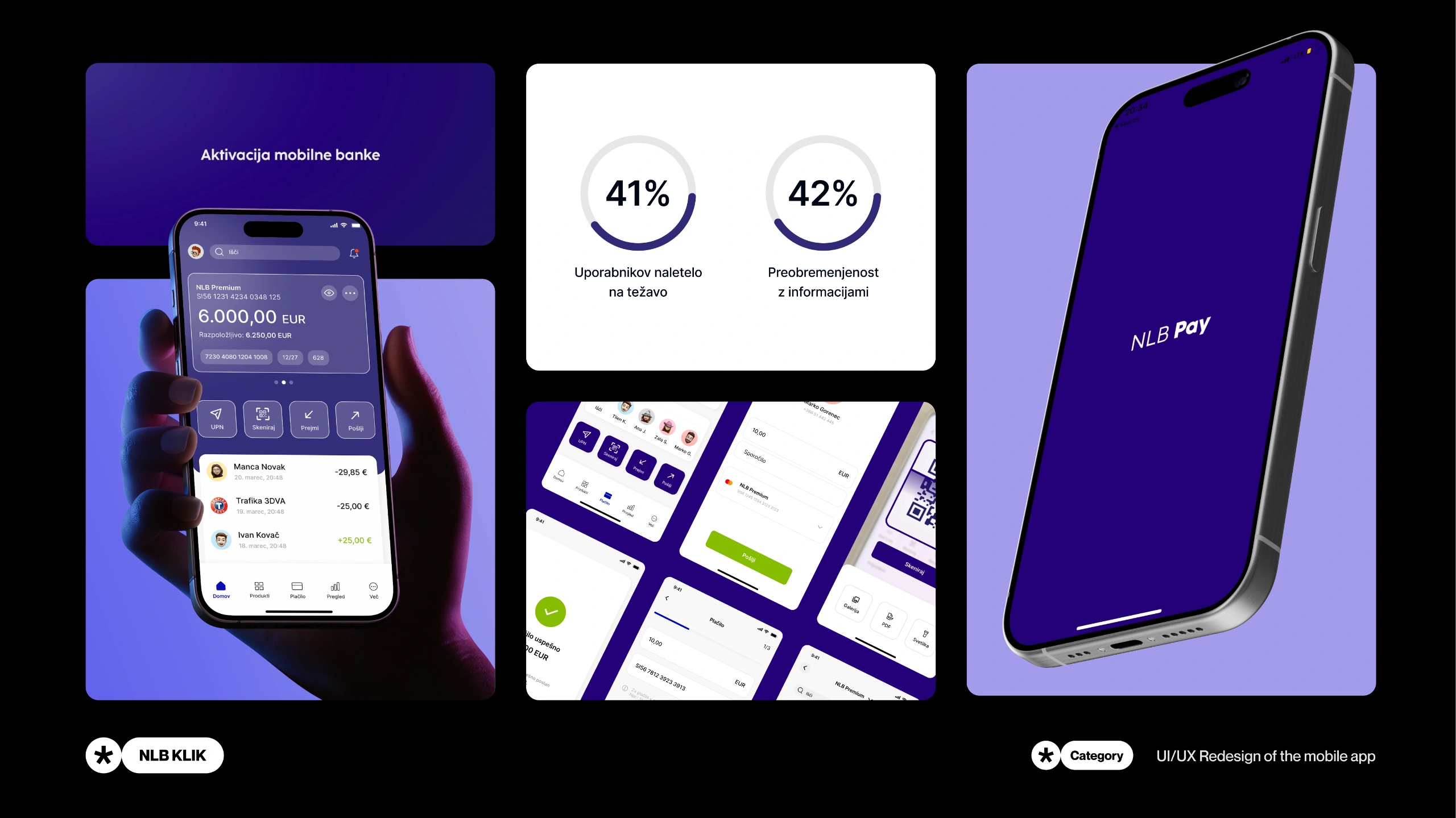
Instead of relying on personal assumptions I gathered feedback from forums before launching a targeted survey with active users. The data revealed that 41% of users suffered from cognitive overload and 95% demanded the integration of separated app functionalities.
Problem
Basic tasks were just too complicated
Instead of relying on personal assumptions I began my process by gathering unfiltered feedback from forums before launching a targeted survey with active users.
Almost half of the users felt completely overwhelmed by cognitive overload due to poorly structured menus and demanded the integration of the NLB Pay app functionalities.
Challenge
Improving the user experience without increasing cognitive load
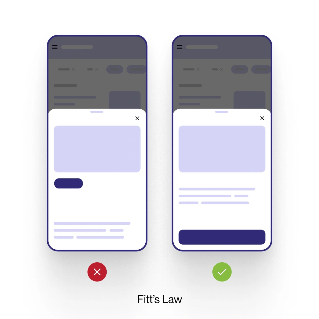
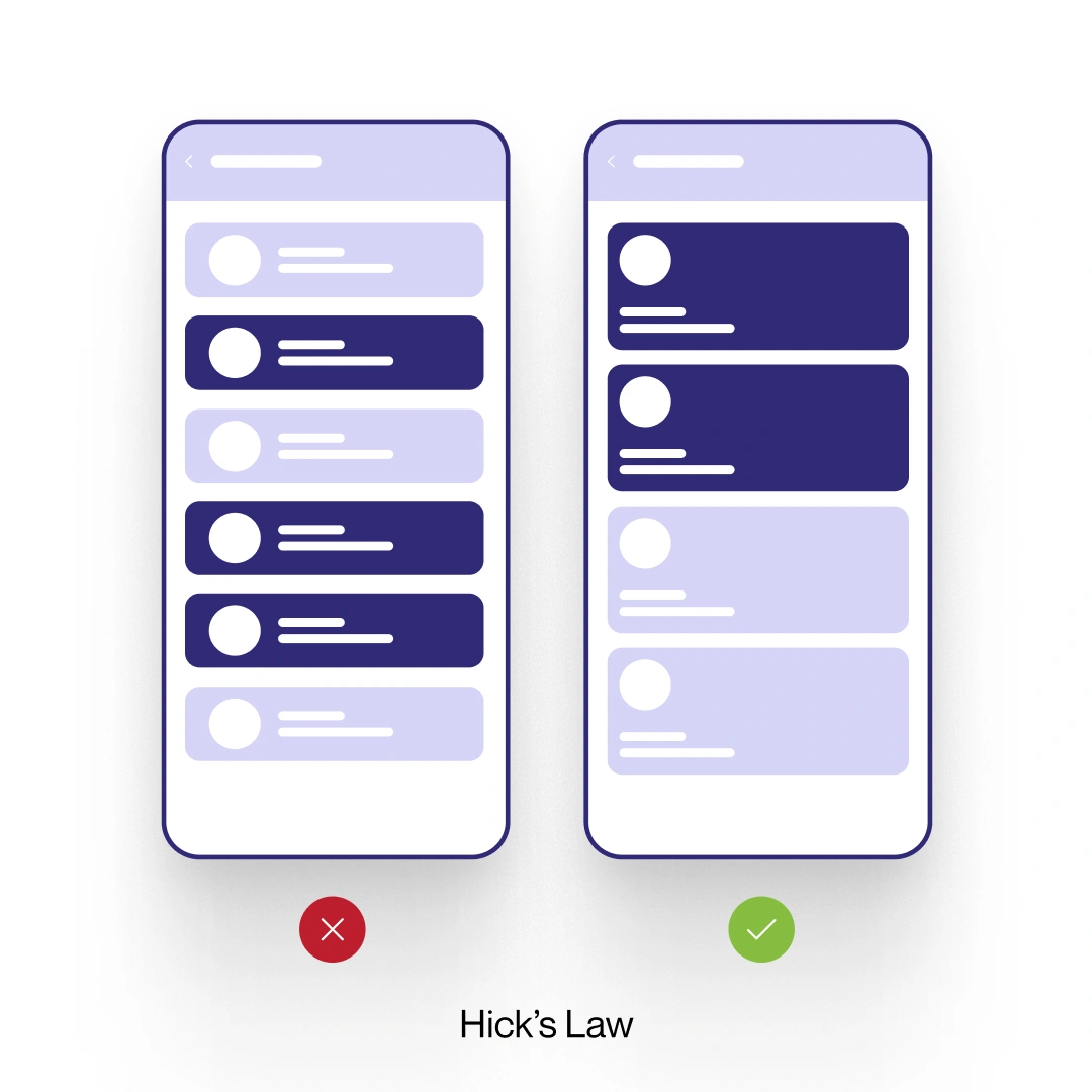
The main hurdle was integrating missing features without making the interface feel overwhelming. I strictly applied Hick's Law to eliminate decision paralysis and Fitts's Law to optimize thumb reachability for core daily tasks.
Ideation
Figuring out the user journey before making it look good
I collaborated directly with study groups to understand exactly how real people expected to navigate. This allowed me to develop logical low fidelity wireframes before building a comprehensive UI design system.
Solution
Redesigning the most problematic screens and flows
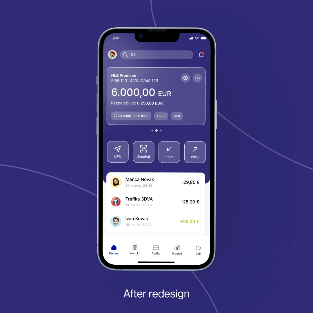
From there I built a complete redesign of the most important screens and user flows where people previously experienced the most problems.
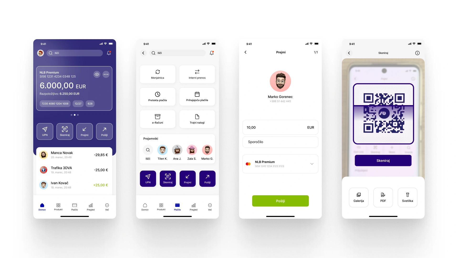
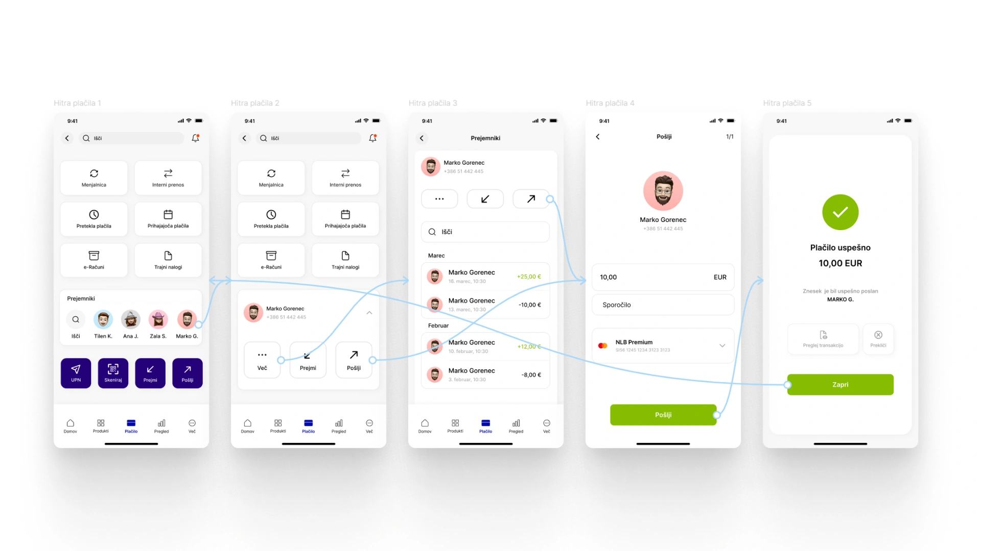
I added highly requested features like integrated fast payments and customizable home widgets while significantly improving the overall UI to ensure a seamless experience.
Testing
Making sure the new design actually works in practice
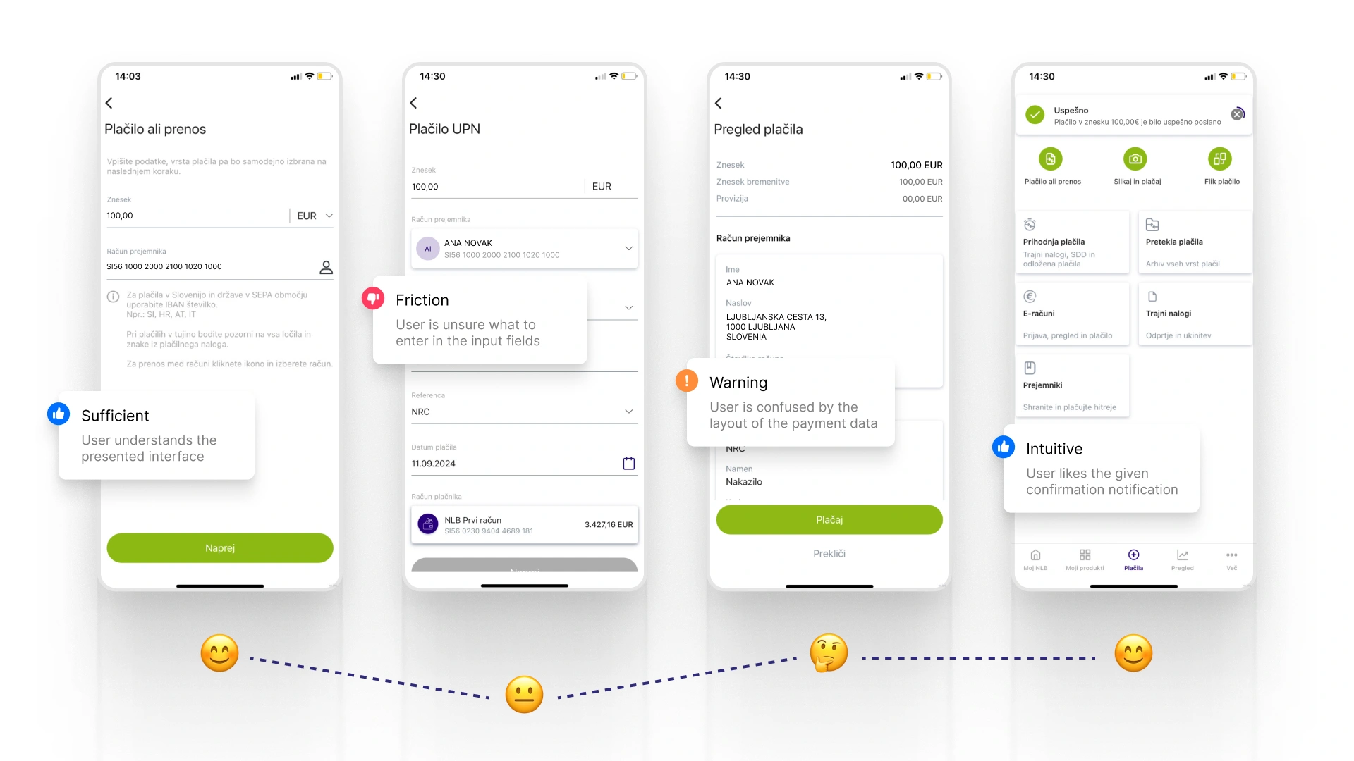
Moving beyond static wireframes I built high fidelity interactive prototypes to make sure my structural decisions actually worked in practice and solved the problems I identified in my research.
This allowed me to physically test the newly consolidated payment flows and verify that users could smoothly navigate from checking their balance on the custom dashboard to executing a fast transfer without experiencing a single moment of friction.
Prototype
Test the full app right here
I translated my final designs into a comprehensive Figma prototype to simulate the live app experience. Getting this into the hands of test users was crucial for validating my design choices and ensuring the new interactions felt completely intuitive.
Reflection
Learning how to fix real user problems
Although I completed this diploma project in 2024 this project taught me how to reorganize a messy product into a user friendly ecosystem. I learned to use design to actively save users time and permanently eliminate digital frustrations.
By focusing heavily on concrete problems I learned how to use design to save users time and permanently eliminate their daily digital frustrations. Do you want to read my full Bachelor thesis (in Slovenian): [Click here](https://drive.google.com/file/d/1Ka-MkanNUOes1o-cZKqCMZ5map6vd8V5/view?usp=drive_link)